
You must log in or register to comment.
Nobody says this lol
Literally all my friends: “yeah it was really nice in [europe/asia] to be able to walk everywhere… But we could never do that back home!”
haha get out.
One of the best posts to ever appear on this community/on this topic
10/10
No. The best posts are news articles about cars being banned.
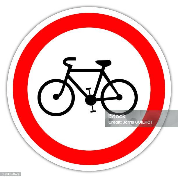
That sign usually means no entry for bikes so I was confused for a moment
Since the sign is turned towards the viewer, it just seems as if someone drunk placed it a few meters right from where it was supposed to be.
Also fits because tourists would ignore most posted signs.
Don’t signs usually have a line through it when it means “no”, or is that just american signage?

You must pay the rent
I can’t pay the rent
We ain’t got the money for the mortgage on the farm!
instructions unclear, the banana is up my ass

You missed the “Caution: A Bannana” sign then didn’t you?
there were three bananas before the caution sign and I slipped
Also, stop signs are
hexagonaloctagonal and yield signs triangular so you could notice them even when they’re not facing you.Edit: octagon/hexagon
Or when covered in snow or if the sign is badly damaged
Stop signs are octagonal.
Red state. We can’t afford the extra 2 sides.
Thanks, forgot how the shapes work lol
This should be in drivers education in Europe
Drivers in Europe, and I assume most of the world, do have to have several theoretical classes about driving and safety to earn their license. Is this not the case where you live?
Yes of course. It is super rigorous. With both required extensive theoretical classes, theoretical test, required session with driving on ice, minimum hours of driving, and a driving test.
I mean’t the humor for teaching it
they are, aren’t they? not with a banana ofc, but I know they are categorized based on shape and color.
Thats confusing.
European bike lanes (like this one should probably depict) are round and solid blue with a bike depicted on them.
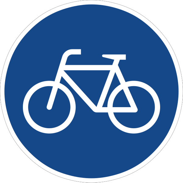
In Europe, lanes, where biking is prohibited are denoted by a round white sign with a relative wide red border (circle) and a bike depicted at its center.

I feel like a single line through would have been the correct design choice, still, because in practically every other context, that’s what’s used (no smoking signs, for example).
Seems like many, many other places around the world put a line through for road signs (though a couple outside Europe don’t, and even some inside Europe do): https://en.m.wikipedia.org/wiki/Prohibitory_traffic_sign
My 2¢, Europe is wrong on this one, despite being right on so much else haha
if I didn’t already know better, i would have interpreted these two signs to be synonymous.
Mandatory signs are road signs that are used to set the obligations of all traffic that uses a specific area of road. Most mandatory road signs are circular in shape and may use white symbols on a blue background with a white border, or black symbols on a white background with a red border, although the latter is also associated with prohibitory signs.
i am now more confused than I was before.
The white zone is for loading and unloading only. There is no parking in the white zone.
Learning Vienna Convention road signs takes a few minutes for the basic principles, an hour or two for the really arcane signs such as “watch out for carriages” and “levy ahead”.
The system is superior to the North American hell system by a huge margin, not least of which because it allows me to drive to Spain or Czechia without needing to study their traffic laws and learn the local language. The signs will be very similar and their meanings otherwise easy to intuit.
Now let me blow your mind: you already do this in NA. But you stopped at yield signs and stop signs. Their shape is immediately recognizable and parseable even if you don’t speak English or even if they are covered in snow (that’s on purpose). Now just imagine every sign is like that instead of the designers giving up and writing some text on a yellow rectangle. “Road work ahead”? Bitch, just put a schematic road worker in a red triangle instead of making me read shit at 90 km/h, this ain’t book club!
You can’t claim superiority just because a lot of countries adopted it, you can only claim wide adoption
… I joke have gone with your view on the assumption that it’s a newer standard so likely better thought out, but not from this thread. Y’all are convincing me of the opposite
Us system makes better use of shapes, colors, and slashes to be more explicit
Red means stop not road work. Here orange is used for road work.
Plus some things really need text.
How would that 60 means 60 km to next town with the name.
One is for waterbikes, one is for Fancy Dress Bicycles Only
Yeah a / would make more intuitive.
Neither is more intuitive, it’s just what you’re used to, culturally. Europeans could equally go to America, see a white sign with black symbol and red border and remark upon learning that it indicates a bike lane ‘That’s just not intuitive’.
Yeah agree.
Is there a problem having a little line through the thing you’re not supposed to do?
/American (sorry) question
That is used for cancelling a previous sign.

This is also used on town/city signs to indicate when you are leaving it (at least in Poland)
Technically that is also canceling the previous sign that said you are entering the town.
Ooooh how interesting!!
Thanks for the embeds as well
In the Netherlands (where this is depicted) it’s typically a white sign with black letters and a red line around it for prohibited, or blue with white text for required
So a white sign with black numbers 80 and a red line around it means prohibited to drive faster than 80, s similar sign with a biker means forbidden for bikes there. If it’s a blue sign with a bike, it means bikes are required ro go here.
A line through it actually means “end of this particular prohibition”
…does a blue sign with a white 80 mean you must travel at least that quickly?..we have minimum speeds posted stateside, although it’s not common…
I can only talk about the Netherlands: Round white sign with a red band, black letters: maximum speed Square blue sign with white letters, advisory speed (advisory speed < maximum speed - 20 )
There is no minimum speed (round blue sign white letters): this is for the simple reason you could technically be ticketed in the case of a traffic jam, yield sign or traffic light
Yeah, as far as I learned, that would be the minimum speed you have to drive in this segment of the road.
Usually, as crossed out sign means it got annulled but there are also some signs, like the sign prohibiting U-turns that have a line through them. But generally the coloring is the major indicator.
At least in the UK which has a lot of common signage with the rest of Europe you normally just have a red circle sign (generally prohibitive orders) with the picture of a disallowed vehicle in. Or a blank interior for ‘no vehicles’. https://www.gov.uk/guidance/the-highway-code/traffic-signs
I agree the the comic is a bit confusing but to be fair it’s in black and white. A red border would mean no entry but a completely blue background would be only bikes allowed.
It makes sense to think that they are car owners that in their regular life wouldn’t tolerate bikes but on holidays find it great.
At least in Europe street signs are color blind friendly. Forbidden signs are white with a dark thick stroke around, while mandatory signs are solid dark color. The colors help, but are not necessary to distinguish the sign.
It does?!
With the wide circle that would normally be red it means no bikes beyond this point in Europe and most of the world
well, that’s very counterintuitive for someone from south america. I’d read it as a sign to communicate the presence of bikes to car drivers.
Warning/Attention signs have a triangle shape:

Poor design. If you were colour blind, that sign would be very confusing. It needs a line through it.
For example, these signs all mean not to do something, and anyone should be able to figure that out:

All language and meaning is rooted in culture - including pictograms.
What would lead to the highest rate of adoption would be universality - both in use and in meaning, which, unfortunately isn’t there yet.
Some european countries use the “crossed out” version on all prohibition signs (circular, black on white with a red outline, and the rest only on directional arrows. No state doesn’t use them, thus failing the secind aspect of universality (consistency).
In general, a red circle means “no”, regardless of it being crossed out. Swapping the red outline for black (and adding in the cross for good measure) suddenly makes the sign mean “now yes”.
Blue signs (obligation) sometimes carry stronger instructions than red ones, and often times the same (e.g. “no tirning left” or “you can only go right” mean the same).
Some places, for readability’s sake make the cross made of multiple thinner lines with empty space, showing the pictogram underneath.
However, what you showed is in fact poor design, as opposed to what you’re calling poor design yourself.
Most people aren’t colorblind in that they don’t see any color (just shades of grey), most, in fact, do see some colors.
Wanting to be fully inclusive, we have three main categories of signs to cover (currently used under the Vienna convention). These are: Obligatory signs (red on blue, no outline), Prohibitory signs (black on white, red outline) and End of prohibition (black on white, black outline, crossed out).
These signs can be fully distinguished by someone truly colorblind - the first group of signs has no outline, the second does, and the third is additionally crossed out.
Sure, the second and 3rd categories could’ve been swapped out (red being additionally crossed out and black not).
However, the Vienna convention was written in the late sixties, pretty much at the apex of black-and-white photography. So, on a b&w photo, a red sign wouldn’t be red. It being crossed out (and black), someone not colorblind would probably jump to the conclusion that, crossed out, it wasn’t important. The outline gives some additional contrast on a light background, carrying a resound meaning - “yes” or “no”.
That’s why this style was chosen. It’s a vestage of a bygone era, but in context it makes sense. And, with “true” color blindness being kind of like a black-and-white camera, the current arrangement is in fact probably the best for colorblind people.
Additionally, when rolling down a highway past the sign you glanced at only for a split second, the red cross would only serve to obscure the pictogram. The pictogram being whole aids in legibility. If it’s the end of the prohibition, it not being as clear seems to be the better alternative.
Poor design. If you were colour blind,
Everybody from Europe would get the (un?)intended meaning of the sign in the cartoon (biking prohibited) and it’s black and white. It just needs to be taught once.
Poor design. If you were colour blind, that sign would be very confusing.
No it wouldn’t. That border shape only exists in red for prohibitions. Even if you were colour blind you could see the border. There is no other sign you could mix it up with.
The strikethrough is in use for a different purpose, to cancel a previous sign (i.e. end of the bike lane).
There is a reason it’s red though, so it stands out. You might not have the time/attention available to clock if the sign has a circle around it if you’re color blind. You see a circle sign with a bike. You have to look extra hard to see there’s another (possibly faint to you) circle on the sign.
That said, I’m not colorblind and forget exactly how that works so maybe the circle actually looks black to them or something.
Why would color blind people struggle with this sign? There are no similar looking signs which mean something different.
The closest one would be this one:

And any color blind person is able to distinguish those two easily.
I see how it can be confusing for someone not used to it but for anyone who grew up in a country where this is the default it is perfectly understandable.
Accessibility needs to be universal. There may not be other signs like that in a particular city or country, but the rest of the world uses a line through “do not” signs.
Even a child could understand what it means, compared to different random coloured edge markings. And that’s exactly the point.
your defaultism is showing. In fact most of the world uses a white sign with red border to mean a prohibition.
and in fact children need to be taught what traffic signs mean all over the world, they don’t magically know it
In fact most of the world uses a white sign with red border to mean a prohibition.
That’s crazy.
Like, this sign means maximum speed limit, not “don’t go 20”…

To me, it’s illogical.
Like, how on earth would the right be better than the left in explaining that bikes are not allowed?

The use of a red border needs to be consistent, if it were to mean prohibition. Yet, it’s not 🧐
We go through all the trouble of making signage without language barriers and still can’t communicate, it’s ridiculous. I would 100% misunderstand European signs in a quick moment even knowing what they should mean, because I have to unlearn 40 years of sign instinct.
Yet you can understand a red light, even without a strike through. Europeans just consistently transferred the principle. A crossed out sign means the regulation ends there, which is extremely intuitive.
same for Europeans in America, we would think all your bike lanes are forbidden for bikes
deleted by creator
Oh good point about color blindess. I never thought about that.
If that’s the signs intent, shouldn’t it also have a line through it? (Like the old no smoking signs?)
I agree that they should but apparently they don’t.
Nope:
https://en.m.wikipedia.org/wiki/Prohibitory_traffic_sign
Many countries use red circle + symbol to depict who is not permitted to drive there.
What’s the etymology of a red circle implying “this is not a thing to do” as opposed to circling something in red to highlight it?
Now you are confusing me. I thought she is taking about the sign and about if someone would propose to put it in her town.
I think she means the whole idea of bike friendly infrastructure as a US citizen. But thats my interpretation, the comic isn’t very clear.
The comic is clear. American suburbanites will go vacation in dense walkable European cities with good active transportation infrastructure and then will return home and attend city council meetings objecting to any plan that would bring similar changes to where they live.
The comic is a commentary on NIMBY behavior.
Yeah it is confusing. But as you pointed out the sign means no entry for bikes in most of the Europe, it doesn’t mean anything in US.
On the other hand this is titled car-brains on vacation. Implying they normally drive cars.
Really confusing.
I think, a “biking prohibited” sign would have a wider black border. Yet, the border of the “bike lane” sign in the picture is a bit too wide, in my opinion, to avoid confusing it with a “biking prohibited” sign.
me too
This comic is ablest. Bikes are ablest. Anything walkable is ablest. Arguing with me about it is ablest. Downvoting this comic is ablest. Everyone but me is ablest.
No, I will not talk about wheelchair accessible infrastructure ever.
[Mod hat on] A note to the person who reported this (and probably some of the downvoters): I appreciate your concern and if I thought this were actually trying to argue against biking and walkability as being “ableist” I’d certainly remove it for misinformation/trolling, but it’s obviously dripping with sarcasm so I won’t. Nevertheless, keep the reports coming because I do take every single one of them seriously.
[Mod hat off] To @UnderpantsWeevil: your joke would’ve been a lot funnier if there had actually been somebody in this thread holding the position you’re trying to mock (and quibbling about sign legibility isn’t that). As it is, it’s kind of a weird non-sequitur that definitely didn’t land the way you intended.
Trying to get out in front of criticism by preemptively mocking it doesn’t delegitimize it. Doing so just makes you look like you just switched topics from fluoridated water and are holding a bundle of stolen copper wire under your arm.


