Updated! Updates are shown in quote text like this. Some scores are updated following app updates.
An Apps Experiment
Introduction
This is an experiment I performed out of curiosity, and I have a few big disclaimers at the bottom. Basically, I’ve seen a lot of comments recently about one app or another not displaying something right. Lemmy has been around for a while now and can no longer be considered an experimental platform.
Lemmy and the apps that people use to access the platform have become an important part of people’s lives. Whether you are checking the app weekly or daily, and whether you use it to stay up on the news or to stay connected to your hobby, it’s important that it works. I hope that this helps people to see the extent of the challenge, and encourages developers to improve their apps, too.
How I did it
I wanted to investigate objectively how accurately each app displays text of posts and comments using the standard Lemmy markdown. Markdown is a standard part of the Lemmy platform, but not all apps handle it the same. It is basically what gives text useful formatting.
I used the latest release of each app, but did not include pre-releases. I only included apps that have released an update in the last 6 months, which should include most apps in active development. I was unable to test iOS-exclusive apps, so they are not included either. In all, 16 apps met the inclusion criteria.
I also added Eternity, which is in active development, although it has not had a recent update. I was able to include several iOS apps thanks to testing from @jordanlund@lemmy.world – Thanks, Jordan! This made for 20 apps that were tested.
Each app was rated in 5 categories: Text, Format, Spoilers, Links, and Images. I chose these mostly based on the wonderful Markdown Guide from @marvin@sffa.community, which was posted about a year ago in !meta@sffa.community (here).
I checked whether each app correctly displayed each category, then took the overall average. Each category was weighted equally. Text includes italic, bold, strong, strikethrough, superscript, and subscript. Format includes block quotes, lists, code (block and inline), tables, and dividers. Spoilers includes display of hidden, expandable spoilers. Links includes external links, username links, and community links. Images included embedded images, image references, and inline images.
Thanks to input from others, I also added a test to see if lemmy hyperlinks opened in-app. There was a problem with using the SFFA Community Guide that caused some apps to be essentially penalized twice because there was formatting inside formatting, so I created this TEST POST to more clearly and fairly measure each app.
In each case, I checked whether the display was correct based on the rules for Lemmy Markdown, and consistent with the author’s intent. In cases where the app recognized the tag correctly but did not display it accurately, that was treated as a fail.
Results
Out of a possible perfect 10, 7 apps displayed all markdown correctly:
Alexandrite - 10.0
Connect - 10.0
Jerboa (Official Android client) - 10.0
Photon - 10.0
Quiblr - 10.0
Summit - 10.0
Voyager - 10.0
Arctic - 9.3
Interstellar - 9.1
Lemmuy-UI - 9.0
Thunder - 8.9
Tesseract - 8.6
mlmym - 8.0
Racoon - 7.6
Boost - 7.3
Eternity - 7.0
Lemmios - 6.9
Sync - 6.9
Lemmynade - 6.1
Avelon - 5.7
Disclaimers
Disclaimers
I Love Lemmy Apps (and their devs)
Lemmy apps devs work very hard, and invest a lot in the platform. Lemmy is better because they are doing the work that they do. Like, a LOT better. Everyone who uses the platform has to access it through one app or another. Apps are the face of the entire platform. Whether an app is a FOSS passion project, underwritten by a grant, or generating income through sales or ads, no one is getting rich by making their app. It is for the benefit of the community.
This is not meant to be a rating of the quality or functionality of any app. An app may have a high rating here but be missing other features that users want, or users may love an app that has a lower rating. This is just about how well apps handle markdown.
This is pretty unscientific
You’ll see my methodology above. I’m not a scientist. There is probably a much better way to do this, and I probably have biases in terms of how I went about it. I think it’s interesting and probably has some valuable information. If you think it’s interesting, let me know. If you think of a better way, PM me and I’d be happy to share what I have so you don’t have to start from scratch.
My only goal is to help the community
I do think that accurately displaying markdown should be a standard expectation of a finished app. I hope that devs use this as an opportunity to shore up the areas that are lagging, and that they have a set of standards to aim for.
I don’t have any Apple things
Sorry. This is just Android and Web review. If someone would like to see how iOS apps are doing, please reach out and I’ll share how we can work together to include them.
Voyager fangirl here. I have used boost, sync, and jerboa, and voyager won pretty quickly.
Having come from Apollo, the dev(s?) really focused on parity and it made the changeover simple.
I used reddit is fun exclusively. Once I figured out compact post size, I was sold. It has every functionality and a great UI and it hardly ever barfs. And it has a Dracula theme for dark mode. Brilliant. Seamless.
Similar progression here. The only thing I don’t like in Voyager is the iOS-isms.
But that’s minor, I got accustomed to the weird icons and so on pretty quickly.
Excellent app, must be absolutely perfect on iOS!
Yup.
Visually I like Thunder quite a bit, but it’s still fairly early in their development so it doesn’t have feature parity yet.
Voyager, while stylistically not my favorite, is the most performant and usable out of any of the apps I’ve tried. It’s what I use most often (though I still have a ton of Lemmy apps installed and occasionally switch around on a new release to try them out).
Relay and Sync were my preferred Reddit apps, Relay probably got the longest use for me, though Sync was the last I used regularly before the API shenanigans.
Visually I like Thunder quite a bit, but it’s still fairly early in their development so it doesn’t have feature parity yet.
Just out of curiosity (no need to answer if you don’t want to) are there any major features missing from Thunder that you’d like to see? I’m not trying to sway you back or anything (it’s not like we have any incentive for getting more people to use Thunder); I’m just looking for ideas to make it as good as possible!
It’s not like I don’t have thunder installed (I’ve actually got it on a few devices), just I don’t open as often. Main reason historically has been content display - usually less link previews, and more often attached local media. Haven’t rechecked in a bit, but I think it’s been a couple months since I had seen an update in fdroid, which is usually my signal to check out the latest.
Feature-wise? Multis would be amazing. Especially with federation where multiple servers have related communities, being able to group what I want to see is awesome. Raccoon just added a (partial, new, maybe problematic) version. Ideally this should be server side, but I don’t expect it’s a high priority item.
In terms of what I can recall off the top:
- Images would get squished in full height mode
- Clear read posts is a super useful one in Voyager, a nice-to-have for thunder
- Had an issue with messages, unable to reply from inbox maybe? Can’t remember exactly what it was.
Regardless, when the updates roll out to the fdroid repos, I’ll be updating and checking it out. I’ve got logins at multiple instances, for different tasks (programming, memes, being hopeful that we won’t have a criminal as president, etc), some clients can be better than others at commenting or browsing or just the way markup looks. So it’s less to me about “best” and more “what I feel like using right now” if that makes sense. Which could be the same thing, but isnt always.
Always happy to try out a new rev though!
Hey, thanks so much for the response! It’s incredibly useful to hear real feedback like that, and I appreciate the time you took to write it all up.
I think it’s been a couple months since I had seen an update in fdroid, which is usually my signal to check out the latest.
Fair enough, this latest release cycle has been a little slower, but there is a new update coming soon. We’re also working on putting pre-releases on F-Droid in a different channel for those who want to be on the bleeding edge (the pre-releases come out much more often).
Multis would be amazing.
I assume you mean multi-communities, where you can view a feed of posts from multiple communities at a time? If that’s what you mean, does this GitHub issue cover your ask?
https://github.com/thunder-app/thunder/issues/13
Images would get squished in full height mode
This one has been hard for the devs to reproduce, but you’re not the only seeing it. If you want to follow progress on fixes, check out this issue.
https://github.com/thunder-app/thunder/issues/1448
Clear read posts is a super useful one in Voyager, a nice-to-have for thunder
This one we do have! It’s available via the Floating Action Button. By default you can long-press or swipe up on the FAB to see additional options, including “Dismiss Read”. But the FAB is also super customizable, so you can make that the default action or the long-press action if you want.
Had an issue with messages, unable to reply from inbox maybe? Can’t remember exactly what it was.
As part of the upcoming release, the inbox has been redesigned, so hopefully replying should work now!
Anyway, no need to respond, just wanted to follow up and say thank you again for the time and the thoughts.
Excited to check the new version out!
I’ll take a look at the GH issues in a bit (super fun work day full of mariadb, disk resizing, and an unfortunately large amount of ec2 efforts…)
I liked Voyager but it didn’t have any link handling last time I used it, not even with Lemmy Redirect, so I just stuck with Thunder.
Voyager has had full link handling for a while (including Lemmy redirect). If there is something specific not working please let me know!
Interesting! I see that it does have link handling now, although I still don’t see it appearing in Lemmy Redirect for me.
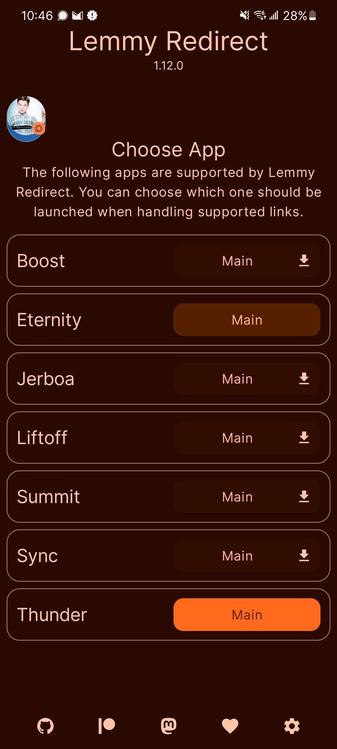
Voyager was added in 1.13.0 https://github.com/zacharee/MastodonRedirect/releases/tag/1.13.0
Ah, I didn’t see that, it hadn’t been updated on the IzzyOnDroid repo. I’ll update to it now and try out Voyager again!
Hello! Voyager/Arctic user her. I see your link on Voyager right now. :)
deleted by creator
Ah! Thank you for the kind explanation, fishpen! That makes a lot more sense! :)
Hello! I’m the dev of Summit. Do you remember what Summit failed on? I would be very interested so I can fix it (seems like it failed maybe one or two things I’m guessing?)
Anyways thanks for doing this!
Ah I think I puzzled it out. Summit doesn’t render subscripts correctly. I’ll fix this in the next update.
This is so cool to see, what a great dev
Great! Thank you for the great app!
Thanks to you
Thank you - I’m not sure if I replied to you individually. I had a couple requests to post more details, which are here: https://lemmy.world/comment/11514952
Test post:
Text (of 6)
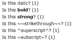
Is this italic? (1)
Is this bold? (1)
Is this strong? (1)
Is this
strikethrough? (1)Is this superscript? (1)
Is this subscript? (1)
Format (of 5)
Quotes (1)
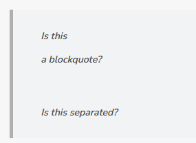
Is this
a blockquote?
Is this separated?
List (1)
- Is
- This
- A
- mixed
- level
- list?
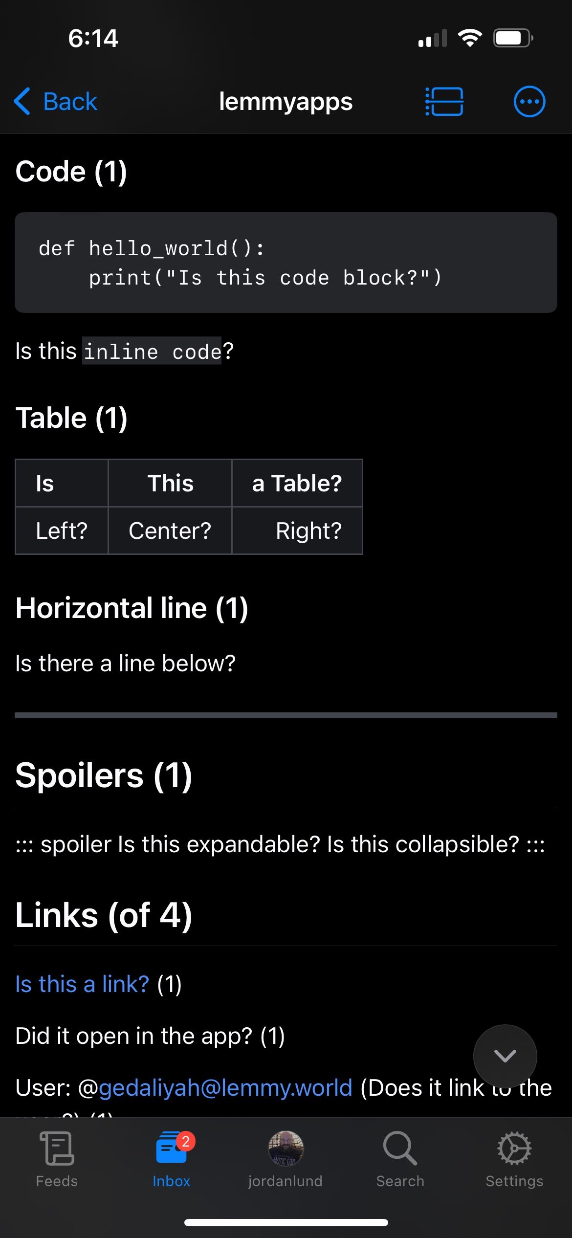
Code (1)
def hello_world():
    print("Is this code block?")
Is this
inline code?Table (1)
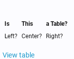
Is This a Table? Left? Center? Right? Horizontal line (1)
Is there a line below?
Spoilers (1)
Is this expandable?
Is this collapsible?
Links (of 4)
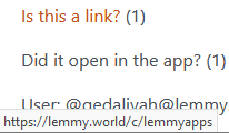
Is this a link? (1)
Did it open in the app? (1)
User: @gedaliyah@lemmy.world (Does it link to the user?) (1)
Community: !lemmyapps@lemmy.world (Does it link to the community) (1)
Images (of 3)

Is Lemmy above? (1)

Is Lemmy above? (1)
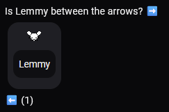
Is Lemmy between the arrows? ➡️
 ⬅️ (1)
Detailed results:
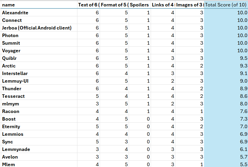
My testing captures are below:
Summit:

Photon:

Arctic:
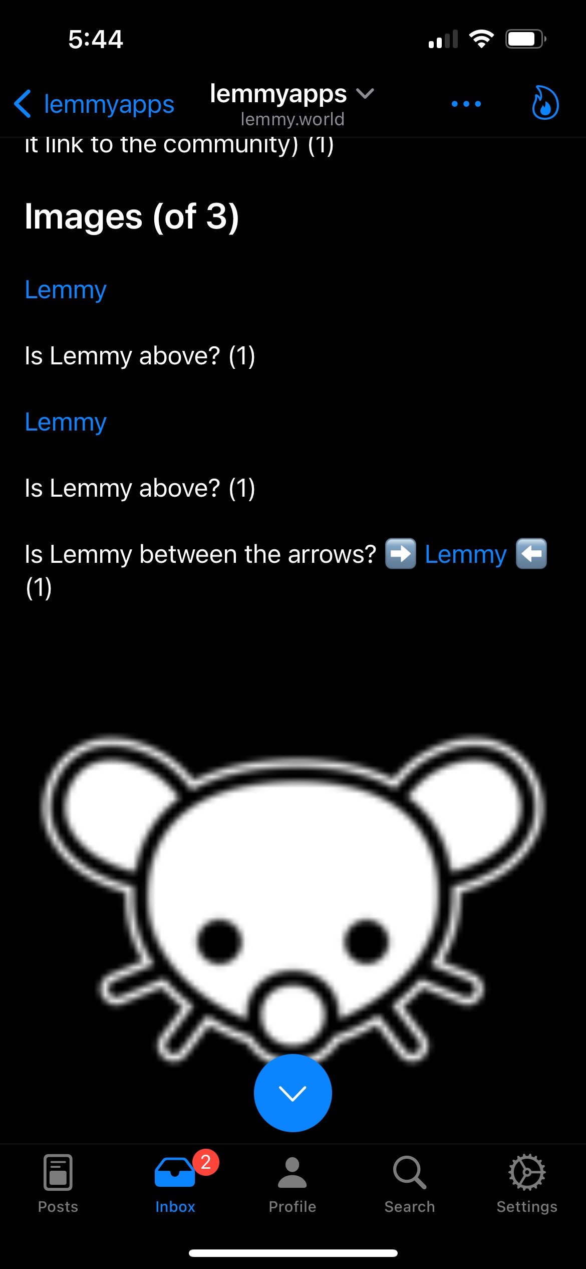
Interstellar:

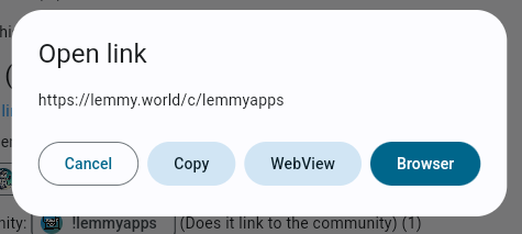
Lemmy-UI:

Thunder:


Tesseract:


Quiblr:



mlmym:
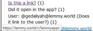
Lemmios:
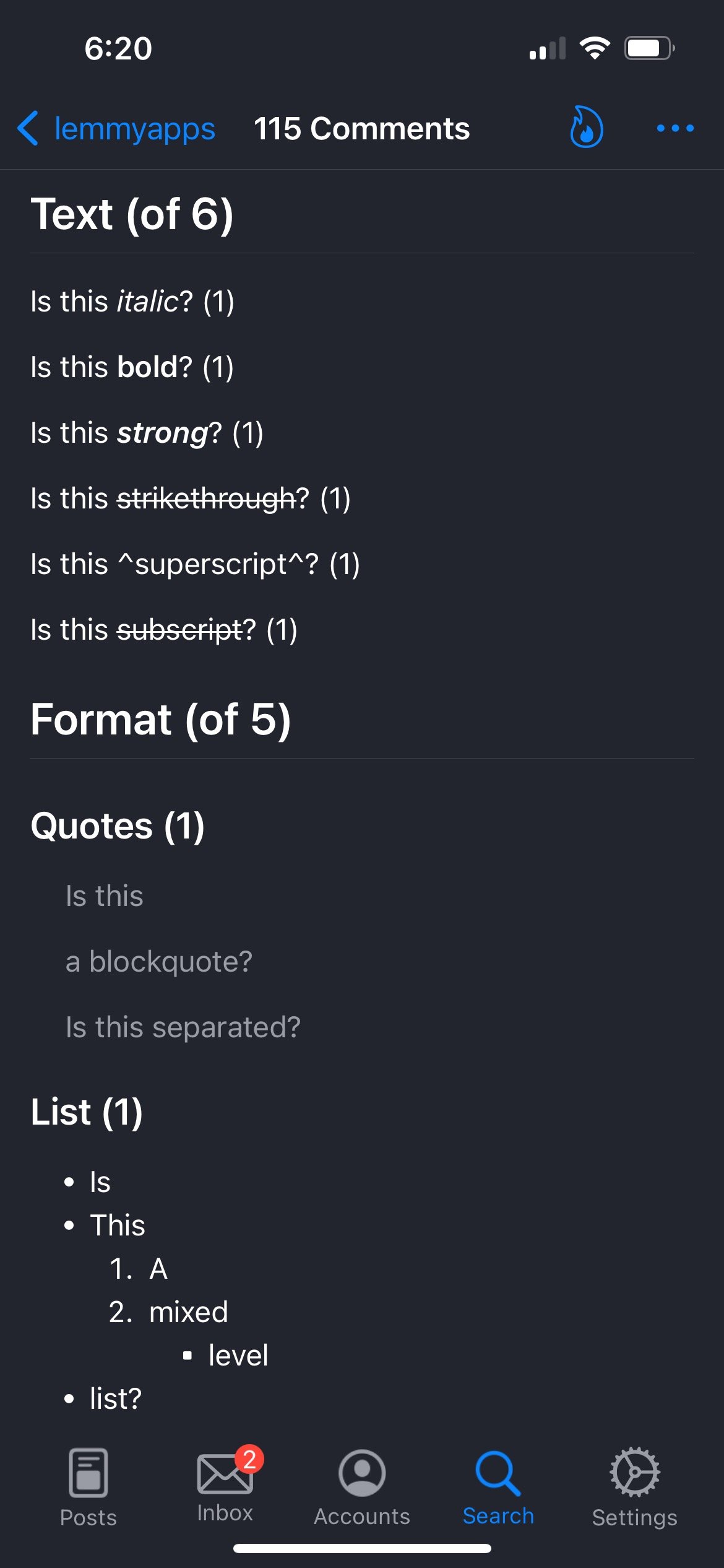
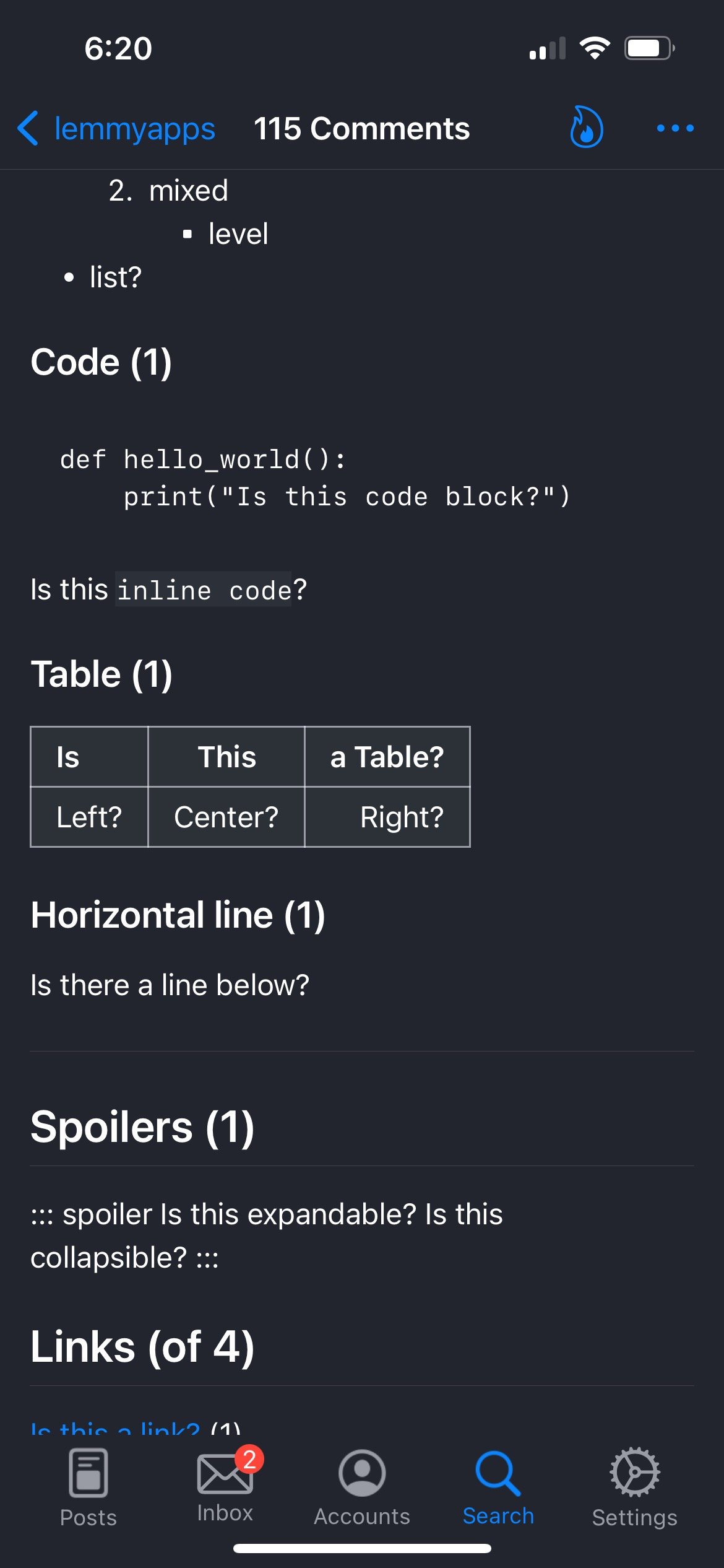
Mlem:
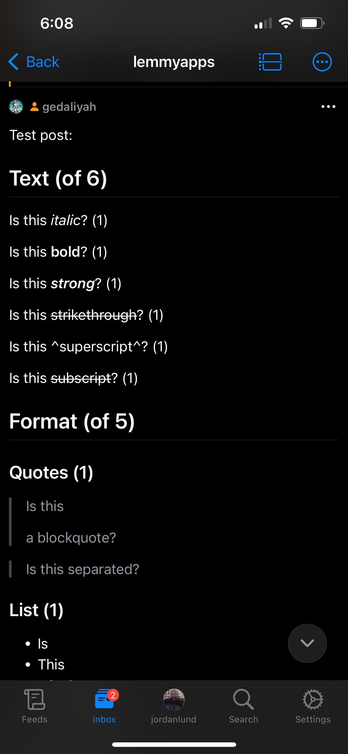
Boost:


Eternity:


Sync:

Connect:

Lemmynade:


Avelon:
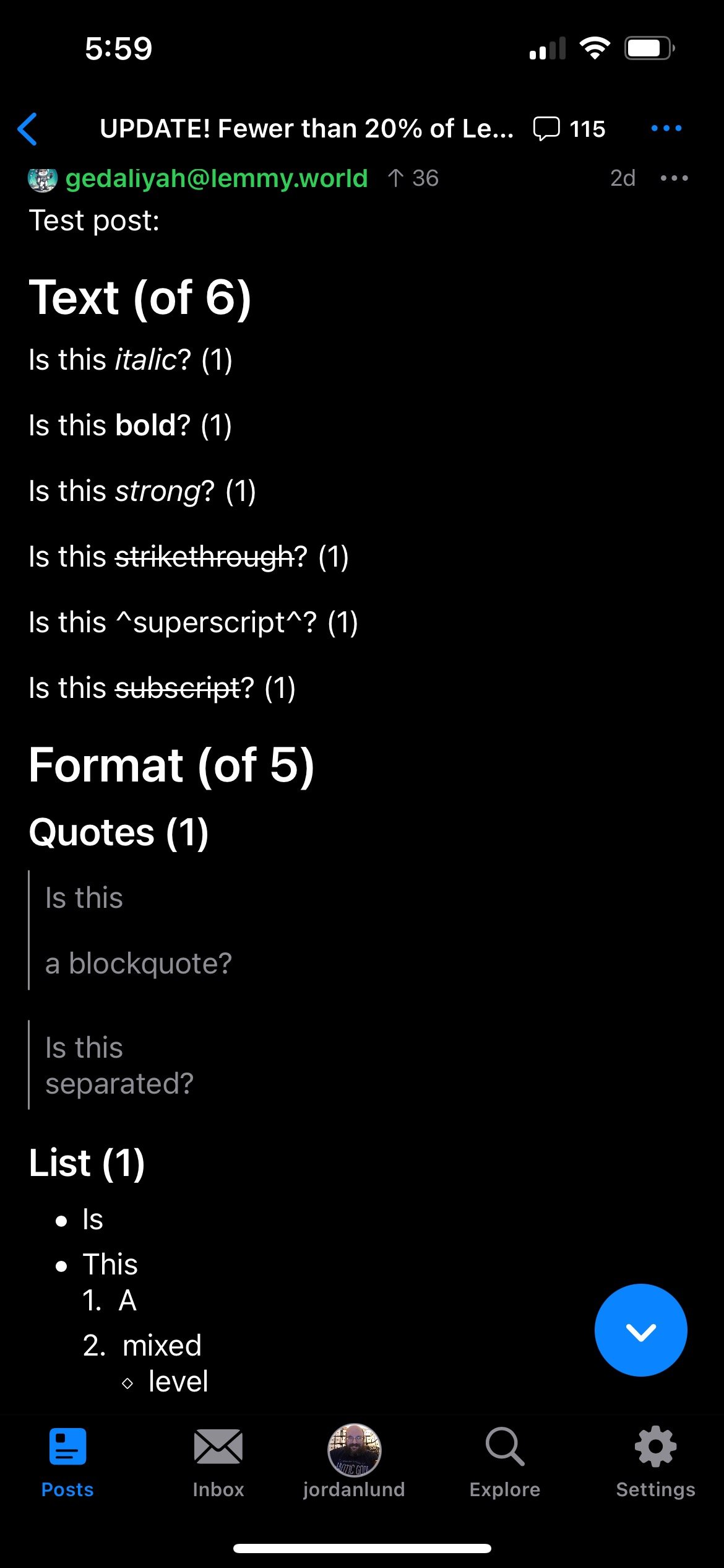
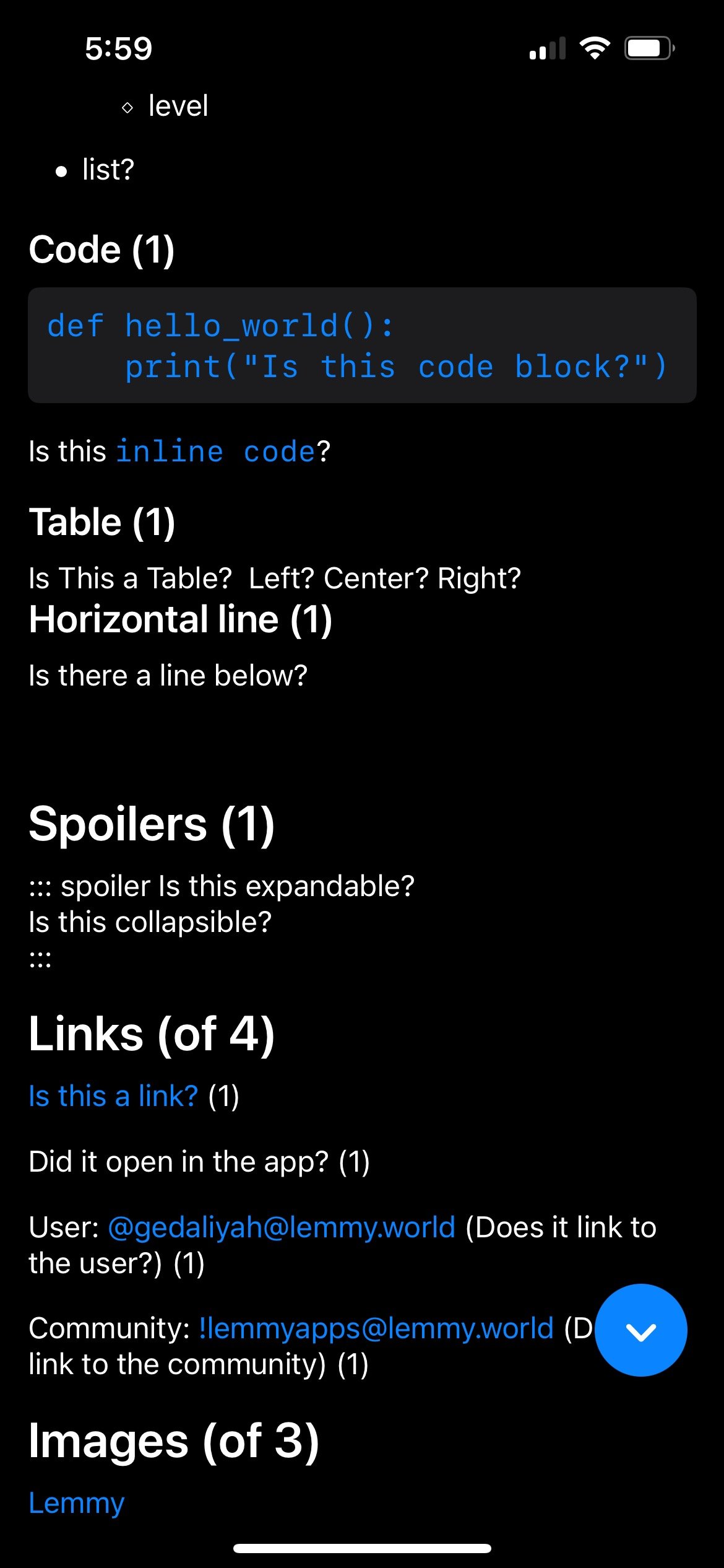
Quiblr should now have each of the markdown criteria fixed. Thank you for the feedback and for your diligence in digging into the markdown and promoting a more consistent Lemmy experience across apps.
Edit: Looks like I missed the “opening link in-app”. This should be updated now!
Connect ok android - everything works except superscript and subscript.
Seems to have been fixed 100% now. 🎉
The third Lemmy picture was rendering full width, it’s now icon sized.
Oh I didn’t know what size the third Lemmy ought to be.
Agree, new update today fixed these!
On Boost, everything except super, sub and spoilers work. @rmayayo@lemmy.world
Send screenshots of the test post linked above and I’ll update it. That was not my result on the device/version I used
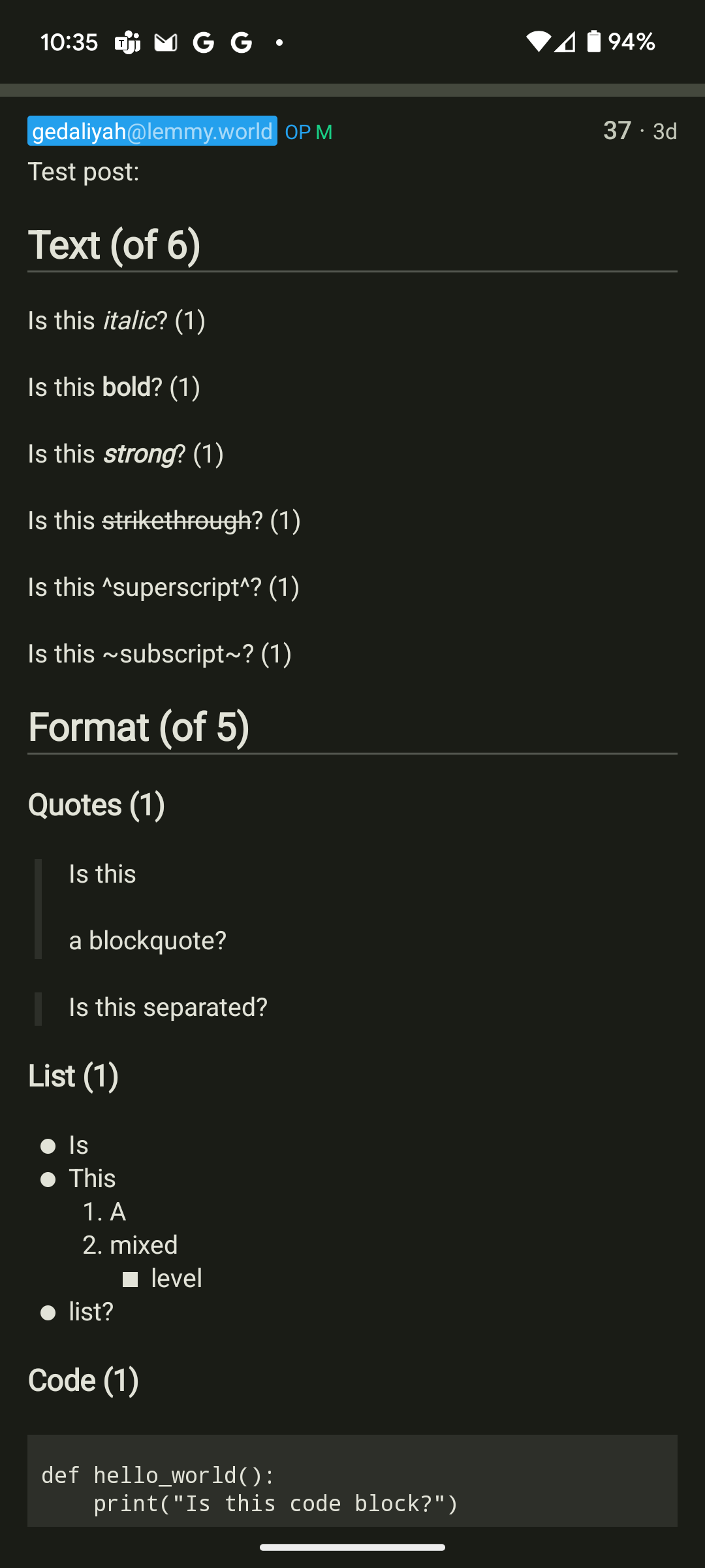
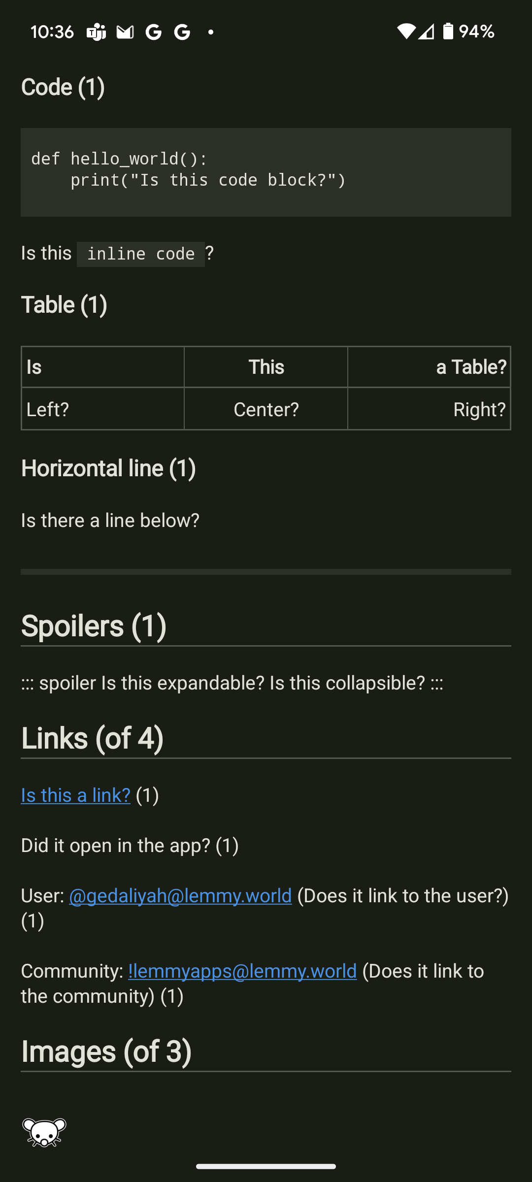
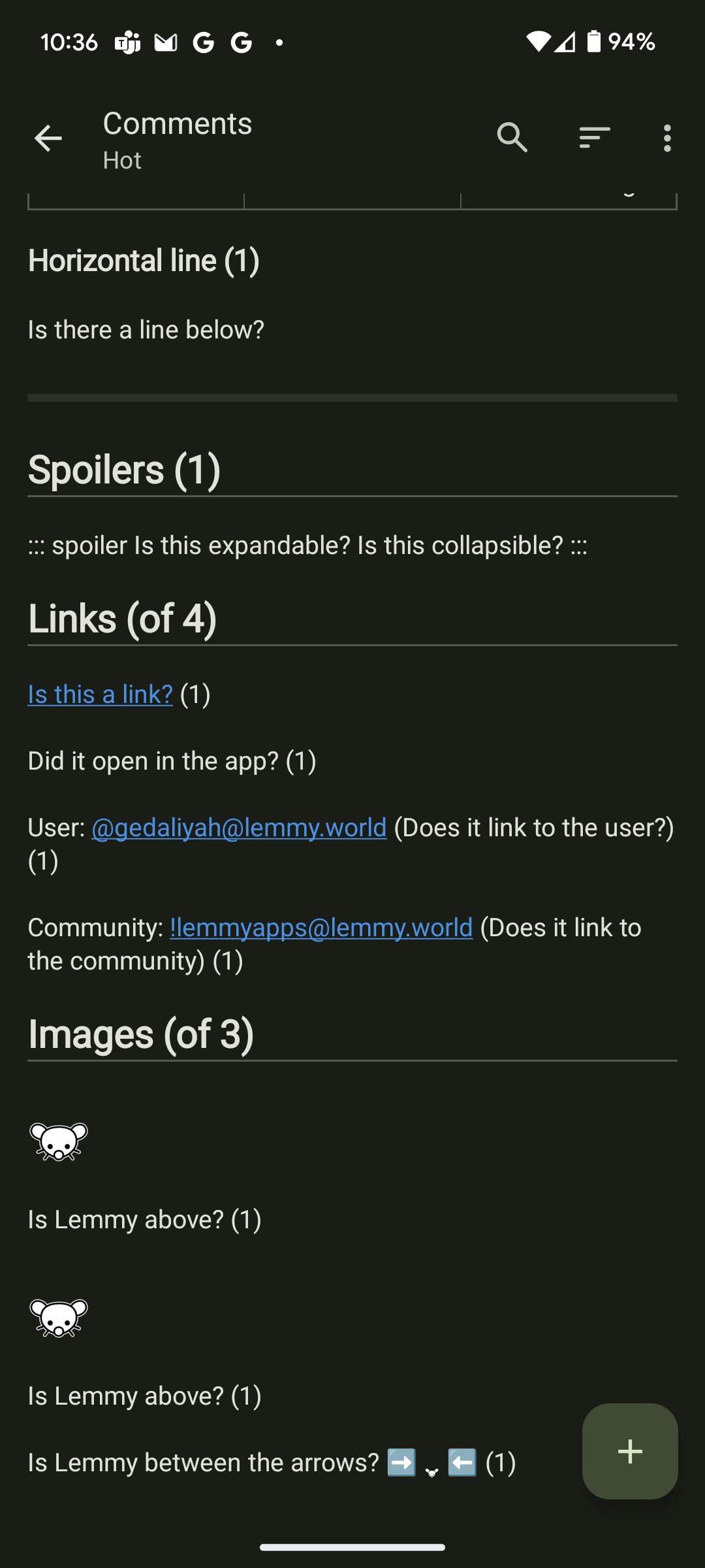
Thank you - that affirms the score above. The detailed results are posted if you wish to confirm for yourself.
Thanks! I’ll update these tomorrow
Arctic: Inline images fail, everything else works!
Avelon: Strong and Subscript both fail. Code, Table, Spoilers, HR all fail. Everything else works!
It looks like the code block and inline code are correct… Am I missing something?
Lemmios: Subscript and Quotes fail, Code and Spoilers Fail
Same thing, the code looks correct to me.
Mlem: Subscript fails, Spoiler fails, 2nd inline image fails.
The code block varies from app to app. I gave it a pass here because it did format it, it just didn’t format it in full color the way other apps do.
That is my experience as well. I’d like to eventually have some more complete review that covers more user requested features and I think having a quality code display would be one of them. There is a lot of discussion about and sharing code, so for some communities it would make a huge difference.
Thanks for doing those tests. I’m honestly surprised Tes scored as high as it did considering I switched markdown renderers several versions ago and knowingly left a few things unsupported.
The one I’m using uses Github style markdown, and I’ve had to add some shims to that to support Lemmy’s flavor. Overall, it’s much easier to work with (and extend) than
markdown-it, but, on the downside, I had to accept that sub- and superscript wouldn’t be supported at all. There’s also some annoying default behaviors that cannot easily be overridden.I’m planning at some point to fork and patch that to address those limitations as well as add some more fine-grained control over the default linkificaiton ( e.g. so usernames without the
prefix won’t be linked asmailto:email addresses). Hopefully those will be accepted upstream, but if not, I’ll probably maintain it for my own purposes.A number of apps struggled with treating usernames as mailto links. Another thing I came across that was not tested here was how some apps fail to render tags inside of other tags.
tags inside of other tags.
[] ]?If so, I didn’t even think to handle those (or recall ever seeing them in the wild). lol. I did think to break out comma-delimited words inside a tag and treat them as separate tags.
Yes, I have seen strange things happen when using tables inside spoilers, or usernames inside code-blocks, etc. Those cases were not tested, but would be interesting to see.
Table Inside Spoiler
Heading 1 Heading 2 Heading 3 Testing 1 2 (Yay, works on my machine)
Works on Thunder.
You forgot about Eternity
Would love to hear about it’s score since it’s my favorite way to browse Lemmy :)
Yay, Eternity fans! So glad that the dev has returned, too.
added above by popular demand
Thank you!
This is helpful!
If you have a list handy for each of the apps, it could be easier to share it with devs and have them look into it. For example, I know Boost doesn’t handle spoiler links, which makes using !dailygames@lemmy.zip a little dicey until I’ve already solved them.
I also wish that Lemmy had a nicer spoiler syntax in general. I’d prefer something like code formatting to support both inline and block spoilers.
Example:
I can’t believe the real culprit was
the butler.I was suspicious when the character was sneaking around, but I didn't think he would go so far as to steal the pets.Spoilers on Lemmy are pretty quirky to be sure. It’s really a collapsible menu. I think it would be nice if the devs created true spoilers like you describe. It would also be nice if you could nest spoilers inside of other spoilers to create a multi-layer menu.
I’m not really holding out for either one, I just think it would be nice.
I’ve added additional details here: https://lemmy.world/comment/11514952
Thanks! I’ll see about making some posts in the communities for these apps (if others haven’t already)
@gedaliyah@lemmy.world iOS testing, not sure how you score these so I just listed out the broken stuff.
Arctic - Link opens in App. Headings fail, images fail, everything else looks fine.
Avelon - Link opens in browser, not app. Manually went to test post. Bold+Italic fails (Italic works, not Bold). Table fails. Horizontal Rule fails. Spoiler fails. Everything else looks good.
Bean - Last updated 7 months ago, comments on the app say it’s abandoned. Link opens in browser, not app. Manually went to test post. Text formatting block fails so hard, it’s not even visible(!) Heading fails. Code Block fails, Inline Code fails. Links and Image work, but not inline, only at the bottom of the post. Table fails. Horizontal rule fails.
CheeseBot - Did not test. $2.99, no free version.
Lemmios - Link opens in app. Everything looks and works great EXCEPT Spoilers.
Mlem - Link opens in browser, not app. Manually went to test post. As with Lemmios, everything looks and works great EXCEPT spoilers.
Remmel - Instant fail. No development in 2 years, unable to even add an instance or an account. Non-starter.
Thunder - Hard to test. Lots of lag for some reason. Link opens in browser, not app. Manually went to test post. That being said, EVERYTHING worked. The lag may have been because I had just linked my account. Testing everything above, then coming back to Thunder, I found it fast and responsive.
Voyager - Link opens in app. EVERYTHING worked. No notes.
So, ranking them:
Voyager - EVERYTHING worked. No notes.
Thunder - Everything worked, but laggy to start with when using a year old account with lots of data. Once it caught up, everything was fine. Would probably be great with a new account.
Lemmios - Link opens in app by default. Spoilers don’t work.
Mlem - Link opens in browser by default but is user configurable. Spoilers don’t work.
Arctic - A few minor failures.
Avelon - A few more failures than Arctic.
Bean - Hey, it works better than Remmel. Probably abandoned.
Remmel - Instant fail.
CheeseBot - Did not test. $2.99, no free version.
It’s late here but I will probably need screen grabs. I’ll msg you in the morning
Yeah, I accidentally posted early. Edited with the screen grabs.
deleted by creator
Do you have more info on how you calculated your scores?
Interesting that you rank the official Lemmy website as not displaying correctly. I would have thought this would be the baseline. Did you use Jerboa as the baseline?
I describe the specific things I looked at in the post. It is based on the standard of CommonMark.org, with the lemmy-specific changes: expandable spoilers, user links, and community links. the Lemmy-UI does not link usernames for some reason. It does detect when you are typing a username and auto-format it into a link through a dialogue: @gedaliyah@lemmy.world but it does not detect and link usernames typed in plain text: @gedaliyah@lemmy.world
Hmm that site seems down at the moment but I was asking more for specific things that led to specific scores for each.
Interesting that it gets a mark down for the username thing. But there must be more. Summit gets a 9.7 and you said each category was weighted the same.
I’m curious if users get notified if you tag them without the full link. That would be a back end action not handled by the app/UI.
If not, you could argue that Lemmy-UI is more correct since apps that do the link might give the impression the user has been properly tagged and notified.
Each category is weighted the same (20%), but not all categories include the same number of tests. Like I said, it’s not very scientific. I did try to ensure areas that are more important were counted separately. So not handling spoilers might have a larger overall effect than handling superscript. Spoilers are used all over, especially in community info/rules, but superscript is less essential (or less disruptive anyway).
Ah I see, thanks for the explanation.
Please post the detailed results, the developers (I’m a small contributor to Thunder, for instance), would appreciate it.
thanks for the suggestion: https://lemmy.world/comment/11514952
Interesting to see that even Lemmy-UI does not display markdown completely correctly
Surprised to see Boost that low in the rankings. Literally the only issue I’m aware of is the spoiler syntax isn’t supported. I’ve always considered it much more solid in the way it feels compared to the other apps. I think I’ve used most of them.
I was not joking about this not being an indication of overall quality. My favorite apps are lower on this list but have other great features! I hope to have a better resource in the future to provide App reviews for different features.
Spoilers are pretty important though. That’s one or like to see in every app.
Gotcha. Like some other users, I’m quite curious to see the details of how you arrived at these scores. The spoiler thing can be important, but for some reason it doesn’t bother me personally all that much. I’m very curious if there are other rendering issues with Boost outside of that one.
Superscript and subscript
ah yep I have seen that too. Thanks!
No Eternity?
Personally, I notice it doesn’t handle spoilers correctly but otherwise no complaints.
Eternity is in active development but does not have a recent release
I understand that you might need to limit your scope in some way but excluding one of the best because it is essentially “too stable” seems silly ;p
Now included above by popular demand
Oh sweet, thanks!
Thanks for the testing! I’m the dev of Interstellar and looked through the list to try to see what I need to improve, but I believe everything you mentioned in the post already renders correctly. Would you be able to give the specific results you found (on what doesn’t work) from your testing?
For reference, I viewed the Lemmy Markdown Formatting Guide you linked, and everything seemed to be working fine on the app.
By the way, I haven’t tested interstellar in a while before this and I was extremely impressed. It’s become a real standout app! Thanks for your work
I really should have taken more detailed notes, but it looks like maybe inline images were the problem?
Is lemmy between the arrows? ➡️
 ⬅️
⬅️Yes, the Lemmy icon is between the arrows.
Looks like they tested with username links as well that I do not see in the formatting guidelines but cuased the lemmy-ui to be the same score as your application, so that’d be my educated guess.
Thanks, but we actually do support username and community links/mentions.
Ah I saw them make this comment afterwards with their tests https://lemmy.world/comment/11504259
Jerboa user checking in. My biggest gripes with it are:
- not always showing me that I have things in my inbox when refreshing my feed
- links from a post to another post seem to render in my default browser (Firefox) vs Jerboa
- every once in a while gbord’s spell check stops working. I haven’t experienced this in other apps, so… maybe something is going on here?
Everything else is pretty solid though. The only nice to have feature would be saving draft replies locally automatically. Reddit is fun did that and spoiled me. Nothing is worse than starting a long reply, life getting in the way, coming back to Lemmy, and being greeted b my refreshed feed.
Your other post on this same topic, with a cross post to this one, renders this way when I clicked the cross post link:
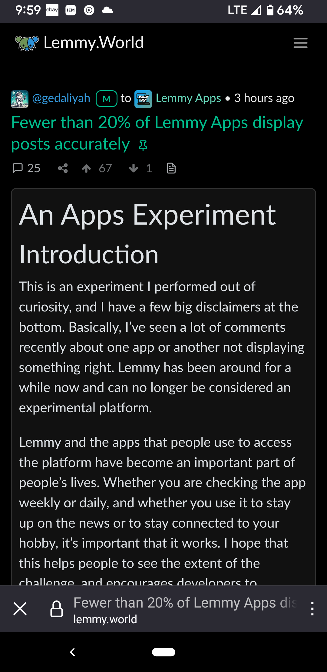
Sync appears to get most of these right.


