You must log in or register to comment.
Lots of orange and red interest spots in California. But that can’t be right. All the right-wing CA-haters keep saying “eVeRyOnE iS LeAviNg CaLiFoRniA!!1!”
It’s almost like they are… talking out of their asses? Surely not!
I mean, they are bad faith idiots. It is worth noting that CA has a yuge outmigration, the largest in the states. It just so happens that enough other people are moving in that the net is big growth.
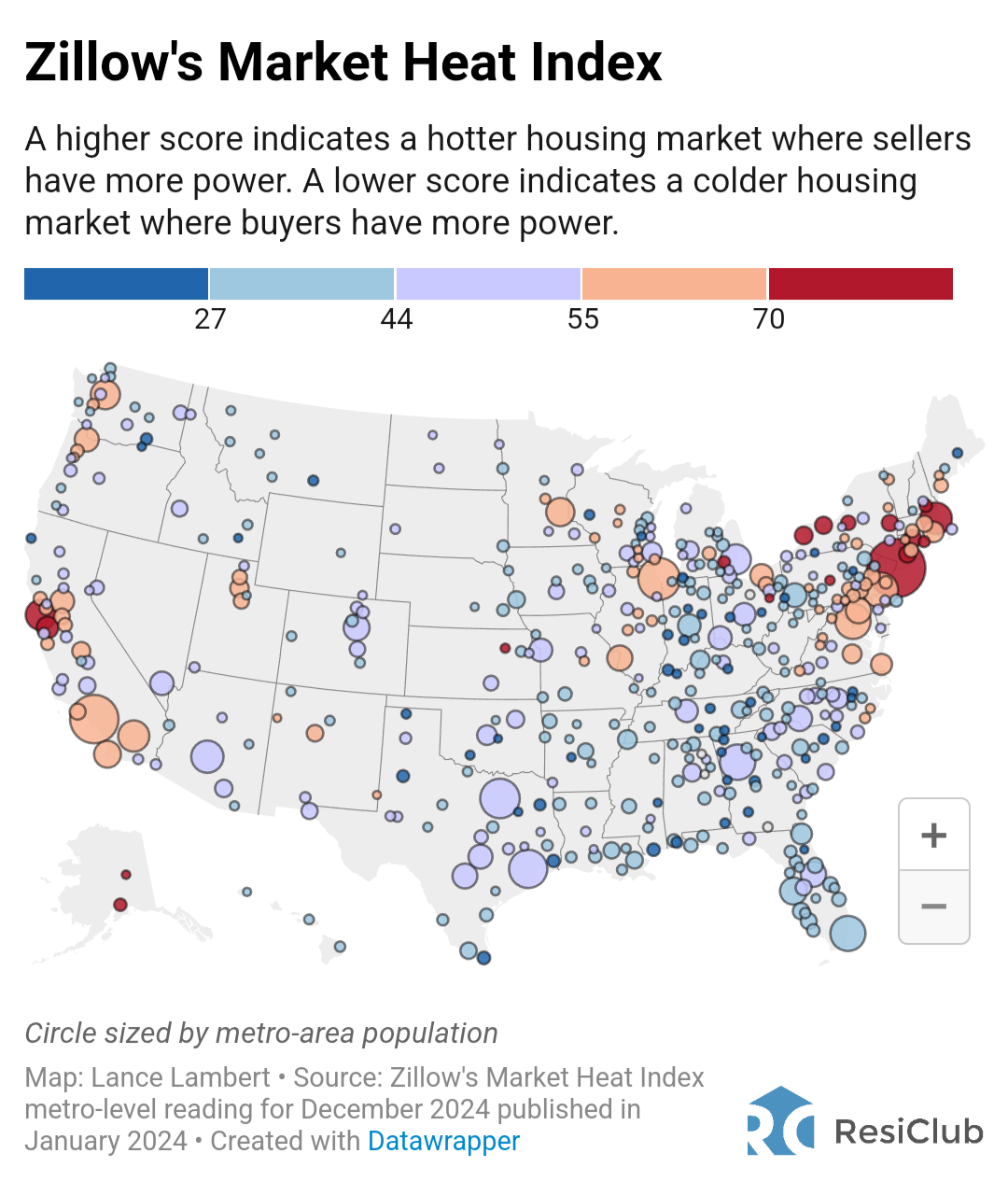
What the red spots indicate is that those areas have housing markets that are very hostile to would be home buyers.
… So, many of them leave, and look to buy a home in a blue area, where home buyers have more leverage in price negotiations, as well as generally lower price per sq ft.
Red does not indicate number of houses bought/sold, in absolute terms, nor in terms of total housing inventory, nor area population.
Californians objectively are leaving California, with huge amounts of money, to states with lower prices homes and goods and services, and functionally doing an interstate version of gentrifying small and medium sized towns and cities outside of California, driving up costs, making everything worse for locals.
This is happening, and they’re not wrong to complain about that.
They are abysmal at figuring out ways to actually solve or mitigate this problem, but they’re not wrong to correctly identify at least one actual cause, though there are many other causes as well.
This doesn’t indicate ‘where people want to buy houses’.
Red indicates areas that have large numbers of interested buyers per unit, low supply levels, low time on market, some combination of that, which indicates that sellers have the ability to set the price in negotiations.
Blue indicates areas that have low numbers of interested buyers per unit, high supply levels, high time on market, some combination of that, which indicates buyers have more power in price negotiations.
The sizes of the circles only indicate the population of the area, not unsold home supply, not home sales in a given period, just the population of that area.
EDIT:
‘Where people want to buy houses’ would be… maybe approximated by number of pending sales or sales entertaining active bids, divided by the overall area population, or overall homes on market.
Or just polling people per location and asking them ‘do you want to buy a home here?’.
EDIT 2: I randomly watched an interview on youtube that actually explained this and a bunch of other more up to date info, earlier today.
Basically, the housing bubble in many areas may finally actually be starting to let out some air… sales are extremely low, inventory is extremely high, time on market is extremely high, and sellers are actually starting to cut prices to try to find buyers.
https://www.youtube.com/watch?v=qvnDGRf_Q8M
EDIT 3:
Also worth mentioning OPs image shows Dec 2024 data.
Jan 25 data is almost certainly already compiled and available to people in the industry by now, if it isn’t available publically … pretty sure the video i linked has such.
All you all buying houses on the Florida coast… I hope you like swimming in your living room
The effect might be from Canadians selling 2nd homes.
deleted by creator
That’s not what this map looks like, though.
deleted by creator
The important statistic is displayed using the color of the bubble, not the size of the bubble.
deleted by creator
It’s just supply and demand.

