Does anyone know of a website that will show you a graph of open/closed issues and PRs for a GitHub repo? This seems like such an obvious basic feature but GitHub only has a useless “insights” page which doesn’t really show you anything.
Gives “rate limit exceeded” and the authorisation link doesn’t work unfortunately.
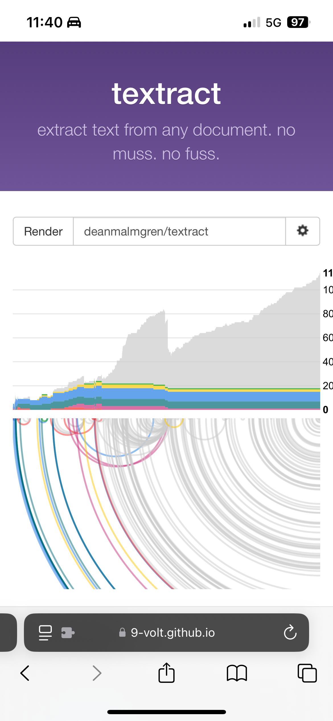
The tools on the page, or the page itself? this is the example repo graph.
And then it says this at the bottom,
#### Why authorize? For unauthenticated requests, Github sets a requests rate limit up to [60 requests per hour](https://developer.github.com/v3/#rate-limiting). In case the number of requests to collect data is bigger than the rate limit you'll have to authenticate yourself via Github OAuth and authorize our application. After authorization your requests rate limit will be 5,000 requests per hour. Enjoy :)The tool on the page. If you try a large repo it will indeed hit that limit, offer a button to authenticate yourself, but if you click that button it never loads the target URL.
If you have some alternative system (Gitea or whatever) that can generate the graph you want, and there’s a way to migrate projects from GitHub, that might do it, depending upon your use case.
That’s… kind of extreme! I don’t know of any alternatives that allow migrating issues from Github and generating these graphs anyway.
Not in the repo itself. But if you create a Project, and add the issues/PRs from the repo to that project, you can generate a burndown chart.
Unfortunately it’s not my organisation so I can’t create a project.