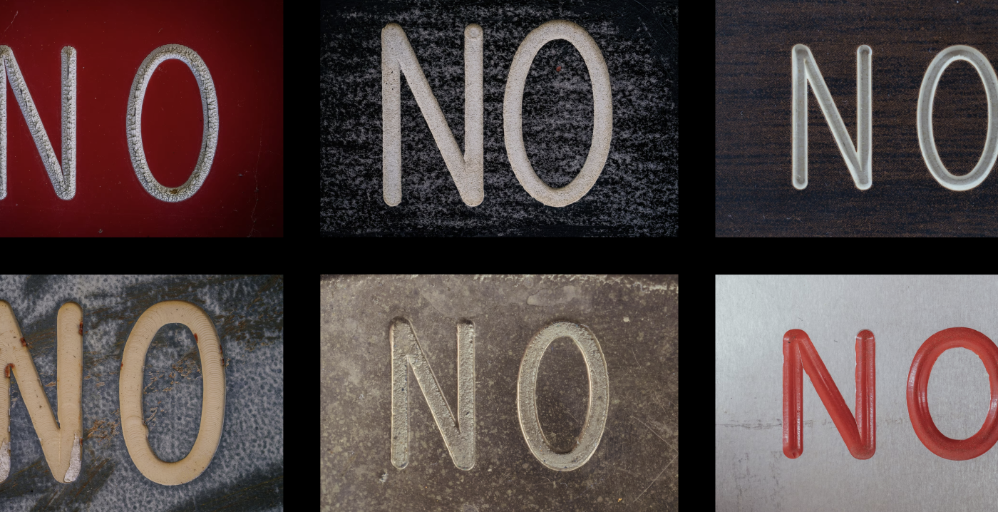
I probably wouldn’t normally have looked at a photo gallery of Manhattan signs, but this made it really interesting.
At one point someone explained to me Gorton must have been a routing font, meant to be carved out by a milling machine rather than painted on top or impressed with an inked press.
Every stroke of Gorton is exactly the same thickness (typographers would call such fonts “monoline”).
Monoline fonts are not respected highly, because every type designer will tell you: This is not how you design a font.
Pen plotters need monoline fonts.
I’ve been kind of interested in fountain pen plotters recently, things like these, as I like the look of fountain pen stuff, but would rather use a computer to do stuff (repeatedly, at scale) than train my hand. I don’t think that there’s anything “bad” about monoline fonts. They’re just designed for a specific purpose.

I probably wouldn’t normally have looked at a photo gallery of Manhattan signs, but this made it really interesting.
Pen plotters need monoline fonts.
I’ve been kind of interested in fountain pen plotters recently, things like these, as I like the look of fountain pen stuff, but would rather use a computer to do stuff (repeatedly, at scale) than train my hand. I don’t think that there’s anything “bad” about monoline fonts. They’re just designed for a specific purpose.