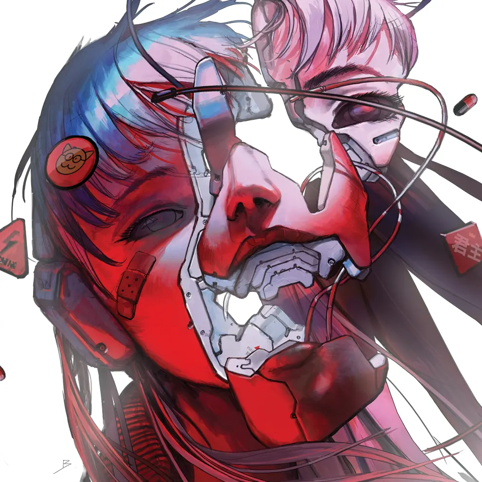
Yeah, I was gonna say “that seems unreasonable”, but I guess if this era in gaming predates a player, that convention of having promotional art to set the flavor of the game is maybe not obvious. I mean, the SNES had to output to PAL or NTSC – the resolution of the display alone won’t let you do too much with an image like this, putting aside the fact that it didn’t have the kind of storage to spend on in-game graphics.
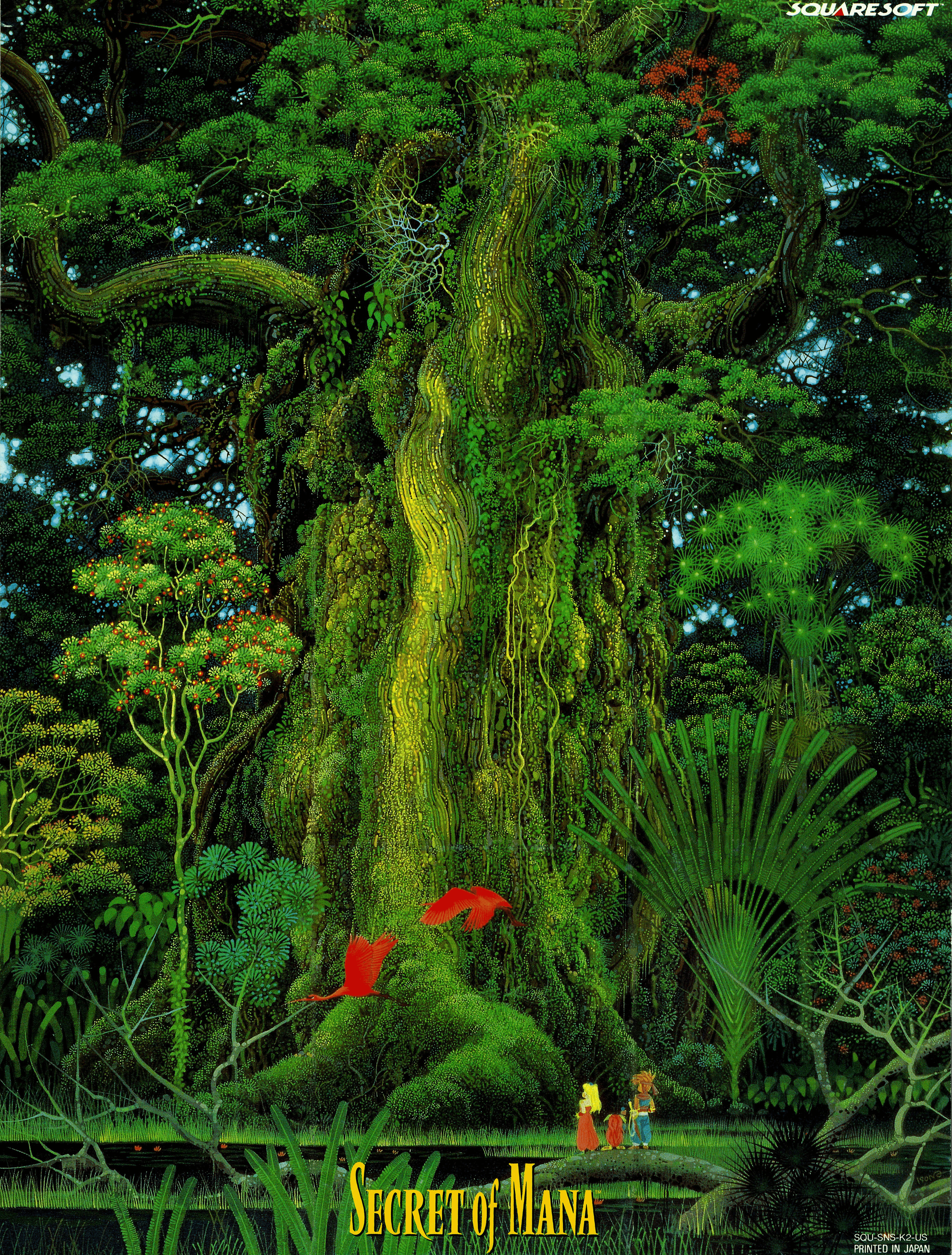
According to this, the largest SNES games ever made made hit 6MB of ROM space. This one image is 8MB, larger than any SNES game ever made.
pretty much any NES, SNES, gameboy, Sega, or PC game from that era
Or for another example: any arcade game from then is gonna have high-resolution cabinet art that’s there to set the flavor. The display hardware on arcade games from the era isn’t remotely-capable of producing an image anything like the cabinet art, much less the computing portion being able to work with that kind of stuff.
I guess you could imagine a point-and-click adventure that looks something like this, but honestly, even today, I’m not sure that any gaming device reliably (i.e. the developer can’t rely on the player having it) can cover enough of someone’s vertical visual arc to make the submitted image practical. Like, just playing pinball games on a monitor with a typical orientation is kind of limiting. Maybe with a new VR headset and taking advantage of head-panning, or a using a particularly large and high-resolution computer monitor and a PC game. I don’t think that any console conventionally gets that much of someone’s visual arc; the displays are larger, but also further away. Maybe if you have a high-resolution phone and hold it near your face.
Another quirk – which doesn’t really affect Secret of Mana, but was common – is that the in-game design of characters sometimes…didn’t look all that much like the box art or cabinet art. My guess, though I don’t know for certain the factor here, is that what happened is that the early concept art went to both the game artists and the cabinet/box art guys, and sometimes things changed over the course of the game’s production.
Like, they’re not trying to do a bait-and-switch with the player – the prospective player can see the demo running on the cabinet’s monitor, knows what the game looks like. It’s just that the hardware at the time wasn’t remotely capable of displaying anything like what the artists would like to do to set mood, so you went with other, out-of-game forms.
EDIT: To try to put this into perspective for the submitted image, the SNES could at most display an 256x224 resolution image. It technically had the ability to choose from among 15-bit color options, but any use of those was greatly restricted:
Each SNES sprite can have 16 colors and a palette slot out of 8 total palette slots. Disregarding advanced tricks like rewriting palette data during a scanline, this is the general limit. The 0th entry of each palette slot is transparent, regardless of what color is specified there.
Total On-Screen Sprites: 128. That’s how many simultaneous entries there are for sprites.
EDIT2: The SNES game’s title screen did briefly display a piece of the actual image, and I’m sure that the SNES guys optimized the hell out of it. Running it in ares and then taking a screenshot, this is what they were actually able to display:
And they wouldn’t have been able to spend that much data on a ton of screens in the game.
I’m sure that the SNES guys optimized the hell out of it.
Ironically, no: the artwork in the game was scanned and used as directly as possible, in a 256-color format so fat that even cartridge loading speed was an obstacle. This is why the game slowly widens the frame to reveal that title screen: you’re seeing everything that’s made it to VRAM.
I have no idea why they didn’t convert the image to 4-bit when it’s all so green. If I was referencing it in a homebrew I’d use Mode 0 for four planes at just four colors each, and have some amazing parallax as the camera craned up.
Screenshot (and this is if one had the fancy color version of the game):
Spaceward Ho!
Box art:
Screenshot:
Mac/PC games normally had (small) screenshots from the game on the back of the box, so someone browsing a store could see what the game itself looked like when being played.

Yeah, I was gonna say “that seems unreasonable”, but I guess if this era in gaming predates a player, that convention of having promotional art to set the flavor of the game is maybe not obvious. I mean, the SNES had to output to PAL or NTSC – the resolution of the display alone won’t let you do too much with an image like this, putting aside the fact that it didn’t have the kind of storage to spend on in-game graphics.
https://en.wikipedia.org/wiki/Super_Nintendo_Entertainment_System_Game_Pak
According to this, the largest SNES games ever made made hit 6MB of ROM space. This one image is 8MB, larger than any SNES game ever made.
Or for another example: any arcade game from then is gonna have high-resolution cabinet art that’s there to set the flavor. The display hardware on arcade games from the era isn’t remotely-capable of producing an image anything like the cabinet art, much less the computing portion being able to work with that kind of stuff.
I guess you could imagine a point-and-click adventure that looks something like this, but honestly, even today, I’m not sure that any gaming device reliably (i.e. the developer can’t rely on the player having it) can cover enough of someone’s vertical visual arc to make the submitted image practical. Like, just playing pinball games on a monitor with a typical orientation is kind of limiting. Maybe with a new VR headset and taking advantage of head-panning, or a using a particularly large and high-resolution computer monitor and a PC game. I don’t think that any console conventionally gets that much of someone’s visual arc; the displays are larger, but also further away. Maybe if you have a high-resolution phone and hold it near your face.
Another quirk – which doesn’t really affect Secret of Mana, but was common – is that the in-game design of characters sometimes…didn’t look all that much like the box art or cabinet art. My guess, though I don’t know for certain the factor here, is that what happened is that the early concept art went to both the game artists and the cabinet/box art guys, and sometimes things changed over the course of the game’s production.
Here’s a shot of Space Invaders cabinet art:
https://lemmy.today/pictrs/image/96d406cb-83fa-4f18-bbe8-9f81fa04924b.png
And a game screenshot:
Like, they’re not trying to do a bait-and-switch with the player – the prospective player can see the demo running on the cabinet’s monitor, knows what the game looks like. It’s just that the hardware at the time wasn’t remotely capable of displaying anything like what the artists would like to do to set mood, so you went with other, out-of-game forms.
EDIT: To try to put this into perspective for the submitted image, the SNES could at most display an 256x224 resolution image. It technically had the ability to choose from among 15-bit color options, but any use of those was greatly restricted:
https://megacatstudios.com/blogs/retro-development/snes-sprite-engine-design-guidelines
EDIT2: The SNES game’s title screen did briefly display a piece of the actual image, and I’m sure that the SNES guys optimized the hell out of it. Running it in
aresand then taking a screenshot, this is what they were actually able to display:And they wouldn’t have been able to spend that much data on a ton of screens in the game.
Ironically, no: the artwork in the game was scanned and used as directly as possible, in a 256-color format so fat that even cartridge loading speed was an obstacle. This is why the game slowly widens the frame to reveal that title screen: you’re seeing everything that’s made it to VRAM.
I have no idea why they didn’t convert the image to 4-bit when it’s all so green. If I was referencing it in a homebrew I’d use Mode 0 for four planes at just four colors each, and have some amazing parallax as the camera craned up.
For a few other games that I’ve played:
Lode Runner for the Mac
Box art:
Screenshot:
Dark Queen of Krynn
Box art:
Screenshot (and this is if one had the fancy color version of the game):
Spaceward Ho!
Box art:
Screenshot:
Mac/PC games normally had (small) screenshots from the game on the back of the box, so someone browsing a store could see what the game itself looked like when being played.