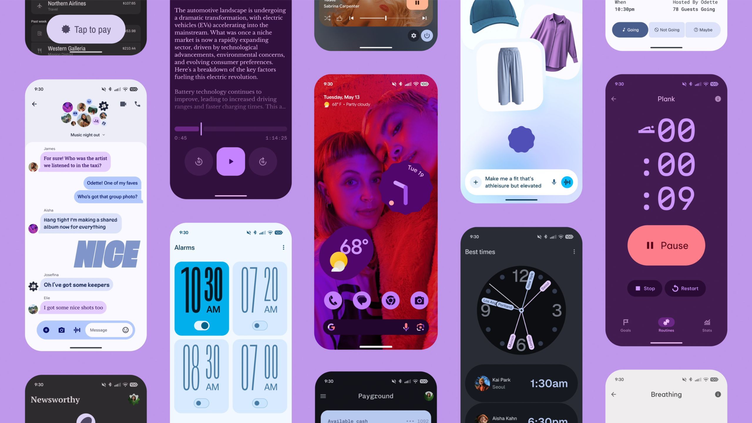
Honestly I think it’s hideous. Wish they would take this one back to the drawing board. I prefer the sleek and minimalist push they used to have, but now it feels like they’re going back in a maximalist direction.
My phone’s OS doesn’t need to be a theatrical experience with every press or swipe, it just needs to get me from point A to point B as quickly and simply as possible.
I might be wrong, but the Material 3 UI feels a lot closer to iOS.
I agree with you, I’d rather have a crazy snappy phone instead of nice animations and effects, but we are in the minority. This doesn’t sell.
Just look at any website. UI graphics are king, and usability is at the lowest it can be.