suoko@feddit.it to Map Enthusiasts@sopuli.xyz · 1 day agoSchool vacations vs work vacations in weekssopuli.xyzimagemessage-square12linkfedilinkarrow-up17arrow-down128
arrow-up1-21arrow-down1imageSchool vacations vs work vacations in weekssopuli.xyzsuoko@feddit.it to Map Enthusiasts@sopuli.xyz · 1 day agomessage-square12linkfedilink
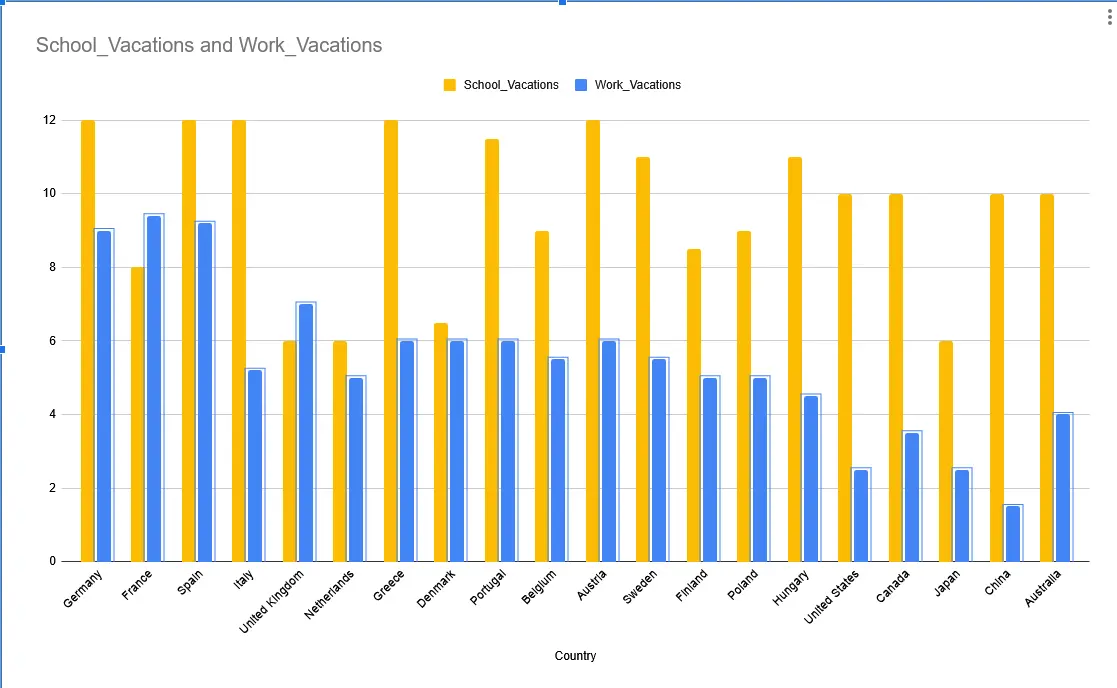
minus-squaresuoko@feddit.itOPlinkfedilinkarrow-up1arrow-down7·1 day agoI was trying to have a working ai prompt to generate this via svg but they’re still so stupid . Countries should have been colored according to the numbers in percentage
minus-squarestephenlinkfedilinkEnglisharrow-up8·22 hours agoSo you admit the plot is poorly done and still decided to share it here for some reason?!
minus-squaresuoko@feddit.itOPlinkfedilinkarrow-up1arrow-down3·22 hours agoYes , for the idea, you know? Jee…


I was trying to have a working ai prompt to generate this via svg but they’re still so stupid . Countries should have been colored according to the numbers in percentage
So you admit the plot is poorly done and still decided to share it here for some reason?!
Yes , for the idea, you know? Jee…