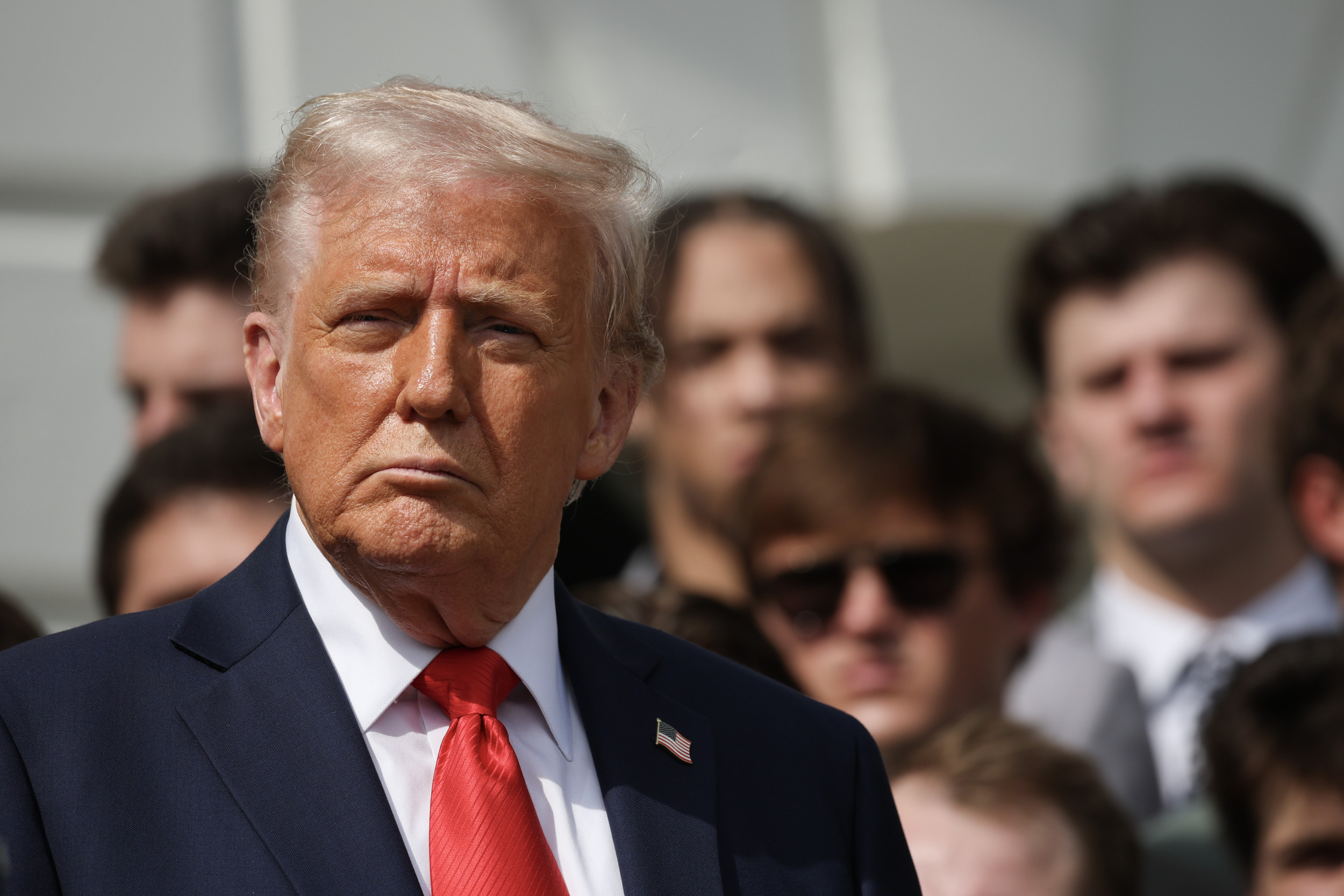
The White House said the higher tariff is as a result of Chinese retaliation.
Archived version: https://archive.is/20250416092702/https://www.newsweek.com/china-245-trump-tariff-2060295
Disclaimer: The article linked is from a single source with a single perspective. Make sure to cross-check information against multiple sources to get a comprehensive view on the situation.


Many, it’s all over the news. It seemingly changes based on emotion though, we thought it was 125% but it was really 145%.
I’ve seen a bunch of articles, each with just the latest number and a date. In order to make a nice graph out of all of them, I would need to set up some sort of webscraping project to pool the numbers together. I’ve also seen a bunch of articles that have other types of graphs and tables that don’t really answer my question. The data is out there, but it’s scattered all over the place.
Don’t know of any, sorry!