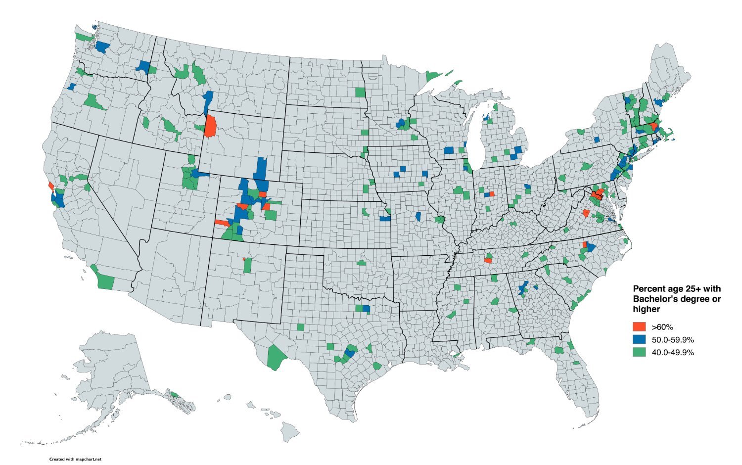
The Picard Maneuver@lemmy.world to Map Enthusiasts@sopuli.xyz · 5 个月前Percent age 25+ with Bachelor's degree or higherlemmy.worldimagemessage-square70linkfedilinkarrow-up1227arrow-down16
arrow-up1221arrow-down1imagePercent age 25+ with Bachelor's degree or higherlemmy.worldThe Picard Maneuver@lemmy.world to Map Enthusiasts@sopuli.xyz · 5 个月前message-square70linkfedilink
minus-squareadarza@lemmy.calinkfedilinkEnglisharrow-up16arrow-down2·5 个月前not really, that’s roughly the percentage for the entire population of the country.
minus-squarefriend_of_satan@lemmy.worldlinkfedilinkEnglisharrow-up16arrow-down2·5 个月前Exactly. The less educated population matters just as much as the more educated. Those people are not represented in this map.
minus-squareadarza@lemmy.calinkfedilinkEnglisharrow-up20·5 个月前here’s all the counties by education attainment. high school, 4-year college, graduate/professional degree. source of the visuals: www.smartick.com/data/visualizing-the-most-and-least-educated-counties-in-america/ using data from the census: https://www.census.gov/data/developers/data-sets/acs-5year.html
minus-squareDahGangalang@infosec.publinkfedilinkEnglisharrow-up3arrow-down1·5 个月前Other than the obvious typo on the top chart, this is really interesting information.
minus-squarekemsat@lemmy.worldlinkfedilinkEnglisharrow-up3arrow-down1·5 个月前Why would they be? The map is clearly not about that information. That would be a map titled “percent people 25+ WITHOUT a bachelor’s degree.”
minus-squareearphone843@sh.itjust.workslinkfedilinkEnglisharrow-up3arrow-down5·5 个月前And those are the people that the democrats ignored.


not really, that’s roughly the percentage for the entire population of the country.
Exactly. The less educated population matters just as much as the more educated. Those people are not represented in this map.
here’s all the counties by education attainment. high school, 4-year college, graduate/professional degree.
source of the visuals:
www.smartick.com/data/visualizing-the-most-and-least-educated-counties-in-america/
using data from the census: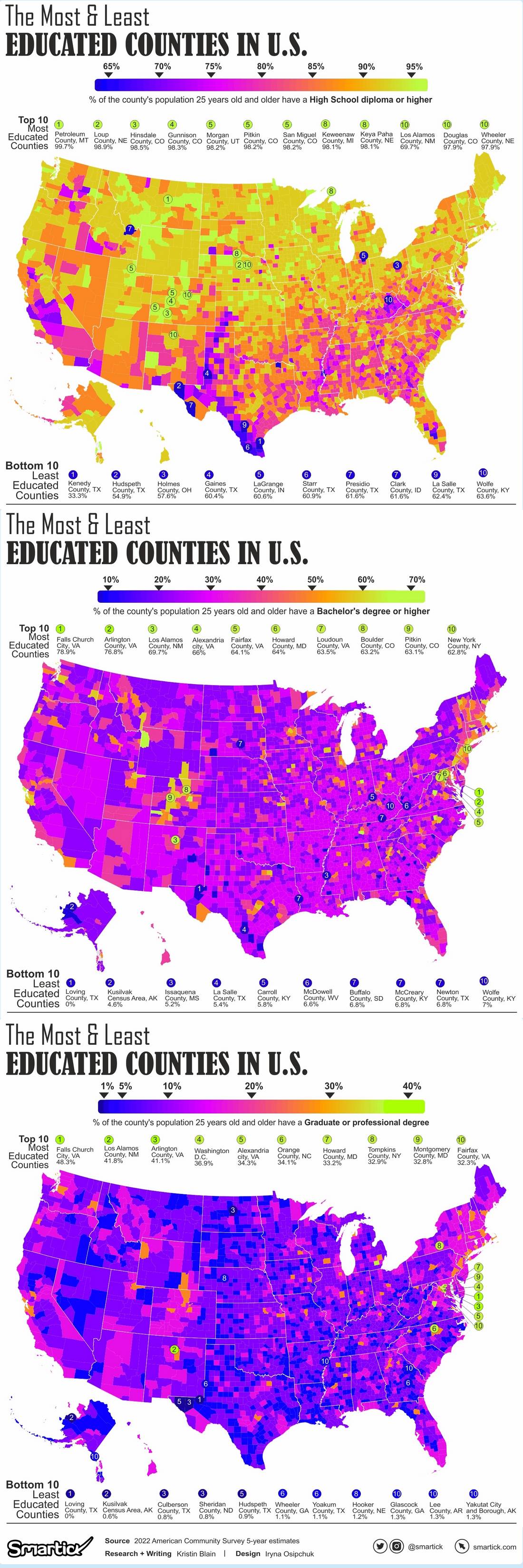
https://www.census.gov/data/developers/data-sets/acs-5year.html
Other than the obvious typo on the top chart, this is really interesting information.
Why would they be? The map is clearly not about that information. That would be a map titled “percent people 25+ WITHOUT a bachelor’s degree.”
And those are the people that the democrats ignored.