I can’t wait for all the Apple haters to absolutely lose their shit over such an inconsequential thing.
I’m not an apple hater, I have a Mac mini. However, our power goes out fairly regularly in the winter, and it’ll get old having to get the thing out of the back of my desk at start it again pretty bloody quickly, it’s an obviously daft place to put it.
Terminal: sudo systemsetup -setrestartpowerfailure on
That’s the most useful thing anyone’s said so far, thanks. My current mini is hard enough to get at, as it’s under the back of the desk, so I’ve used this, as even though the power button is in a vaguely accessible place, there computer isn’t. Why would I want it taking up room on the top that could be used for synths I can’t play, and coffee I haven’t drunk?!
You can power it on using the keyboard. There’s a power button there.
Is the keyboard not bluetooth anymore? The computer would have to be on to connect to a bluetooth device. If they still had wired keyboards on the other hand…
You can connect the keyboard with the USB-C cable. That’s how you charge it anyway.
Although, I know everyone here absolutely hates the idea of ever plugging in an apple device to charge it. Just look at the conniption fit everyone throws over their mice.
Of course, people who don’t care for it could simply not buy it, but then nobody would ever have anything to make a comment about. This whole community is 99% rage, posting about things that could not possibly matter less.
Whaaa? The charging port isn’t on the bottom of the keyboard? 😂
Ah, if I used a Mac keyboard then I’d probably have known that. I generally don’t really like Mac peripherals, I’ve got a full size mechanical keyboard and a thumb wheel mouse. I get that it’s not an insurmountable problem, but there’s only one face out of the six that you can absolutely guarantee isn’t going to be immediately accessible, so why put the only button on the whole machine on that face, as opposed to next to all the I/Os?
This is already been explained to you. Asking the same question more than once expecting a different answer doesn’t seem sensible.
Can you also use that button for hard reboots? Because I use the power button for that with some regularity.
Then it sounds like your problem isn’t where the button is, it’s that you have to keep pressing it for hard reboot. Sounds like you have a software issue that needs resolving.
Oh just solve all the software problems in the world so this need never arises. I’ll get right on that.
Once again, it not Apple’s fault that your computer keeps freezing.
If you put a fraction of the effort into fixing it that you do into whining about things that are your own fault, you’ve had it solved already.
You’re adorable.
Set your energy saver preferences in System Settings to automatically restart the computer after a power failure.
Do you not already have to reach behind your current Mini to turn it on in the instance the power goes out?
Now instead of reaching around, you just would have to reach to basically the same area and press a button underneath. Unless you have a bunch of junk on top of the computer, it’s going to take the same amount of effort.
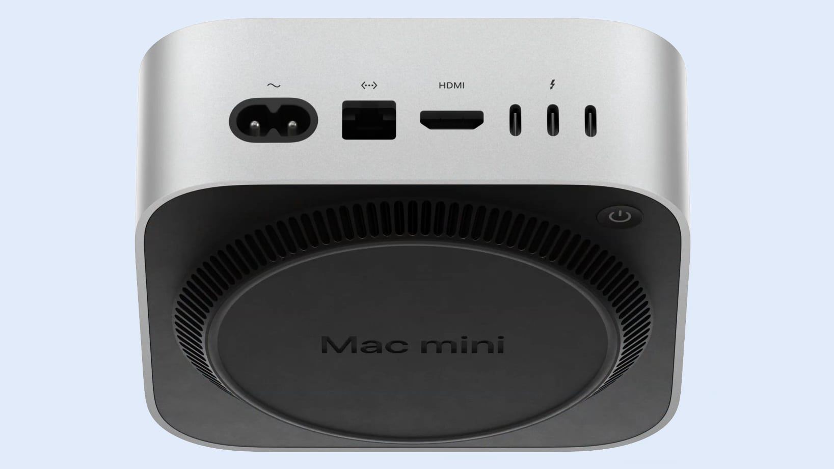
It looks like the foot/base bit isn’t tall enough to get a finger to the button without lifting the thing up. That seems daft to me. You’re having to move the whole unit about to push a button
It’s in a weird spot, but it’s also 1.5lbs. so I don’t feel like it’ll be too much effort to slip a finger under there.
That’s what she said!
Mine is rotated sideways so the button is on the corner nearest me. I care more about good access to the cables than I care about the ooh aesthetics of looking at the smooth front. Bottom of the fucking device is not what I call good access.
You could just use the new one upside down, and mash that unobstructed power button to your heart’s content. You’ll have the same great access to the ports too!
Unfortunately that screws up the air flow for heat dissipation, which is an integral part of the case design. Otherwise I’d totally just do that.
Oh interesting! I hadn’t considered that. How does that happen?
Apple thinks that loud fans are a bad user experience, and I can’t fault them on that. So they design around convection as much as possible: hot air rises and leaves the case, cool air enters from below and the case geometry and plastics guide it to the areas that need it most, just by their static shape. That carefully crafted path for the air to follow is designed around the computer being right side up and it doesn’t work the same if the thing is inverted.
It reminds me of the Apple mouse situation
Another thing that has never been a problem in the decade and a half that I’ve had a magic mouse. Is it dead? Plug it in for 15 minutes and go get some coffee and maybe have a pee. Plug it in when you’re done at the end of the day, and you’ll be golden for a month.
I almost made it to Best Buy checkout with a Logitech mouse that would’ve been perfect for my needs and preferences, but two Apple hitmen came out from nowhere, intercepted me, pointed a gun at my head, and frogmarched me back to the Apple section. Now I’m forced to use this fucking Magic Mouse. Fuck you Apple.
I would argue that getting all twisted up about something so inconsequential is stupid and petty.
You’re changing your whole workflow to bend to their will.
No, you’re plugging it in for 10 minutes if you somehow manage to forget to leave it plugged in overnight once in a while.
It must be nice to be immune to random interruptions and 15 minute delays.
Apple fanboy here. This will prevent me from upgrading from my M2 Pro Mini. I’ll likely end up buying a Studio at some point if they don’t come out with an iMac Pro.
It’s genuinely one of the dumbest things Apple has done. And that list is growing with nearly every product they release.
You’re refusing to upgrade because of the location of a single button that you’ll hardly ever use.
Don’t pretend that’s reasonable.
What’s unreasonable is Apple’s design philosophy.
I don’t want to have to unbuild my desktop and unplug everything from my computer just to turn it back on. I don’t even know how I would use this computer in my setup. Because Apple didn’t want to expose a power button. Or because they chose to cut corners.
It’s not unreasonable just because you don’t like it. And it’s not Apple’s fault you set your desktop up the way you did.
That would be your belief that it’s not unreasonable to have to physically pick up and upend a desktop computer in order to turn it on. For the rest of human civilization, the concept alone is ridiculous.
No. It’s not Apple’s fault I configured my desktop to be efficient and ergonomic. It is their fault that they first made a large screen iMac (with an inaccessible SD card slot on the back) which was best suited for my needs, then discontinued that product which required I replace it with a Mini (and third party monitor equalling more than the price of the iMac), put the button on the Mini which is nearly impossible to feel in the first place, left out an SD card slot requiring that I purchase accessories to reasonably use my computer for computing, and then created a replacement product which requires unplugging things from it and physically lifting it up to turn it on, hindering the ability for a reasonably efficient desktop configuration to be upended so they could save a couple dollars on their product.
Please, you can feel however you want about this but it’s an objective fact that this is not a reasonable location for a computer power button. I really don’t care that much other than the fact that that I’m already prepared to not replace my current Mini with another Mini. The Studio Mac will probably be my next computer because it reasonably has a power button in an accessible-ish location and comes with an SD card slot; even though it’s far more computing power than I’ll ever need and more than I can reasonably afford.
I would imagine you also believe it’s “reasonable” to forgo an SD card slot in favor of plugging your camera into the computer or having to purchase one or more accessories to reasonably use a desktop computer to add files to it.
Edit: I will note, to Apple’s credit, they put the headphone jack on the front. It’s sad how awesome something so obvious can be.
The funny thing about your edit is that I wish the headphone jack was still in the back because I use regular speakers and all my headphones can connect via usb. Now, unless I use a dock (which will probably have to happen anyway eventually, to be fair) I’ll have to plug things in the front and back at all times.
I guess that does make sense for powered speakers.
My speakers are passive so I have a preamp and amplifier powering them which comes off USB-A. Both the preamp and amp have a headphone jack on the front. I also have one of those Satechi Mac mini docks that has a headphone jack.
The Satechi reminds me that there are some smart third parties out there there. I could imagine a peripheral that’s loaded with some front mounted ports (usb, headphone, SD card). And maybe they could figure out a purely mechanical lever to press the power button. I would think that issue is more about the force of the press being enough to press the button without lifting the computer itself off the peripheral. Such a device would get me more excited about the new Mini. Although, I despise having to purchase peripherals to resolve bugs (I just bought an iPhone 16 that required a case so it doesn’t wobble on a flat surface).
I didn’t read that. It’s unfortunate that you have decided to arrange your computer and desktop in a way that makes using a computer difficult. Don’t blame Apple for that.
That’s your choice.
I like that Lemmy has this function to block trolls.
@oxjox @EleventhHour Mac OS will power down the Mac without ever touching the power button. We’re not animals.
And how does it turn itself on?
I actually have to press this all the time when my mini freezes or there has been a power failure. My mini has quite a few cables plugged into it and a stack of drives on top. So yeah lifting it up to press a button is decidedly inconvenient and inelegant. It’s not killing anyone’s babies but we’re talking about product design here. Inconvenient and inelegant are 100% fair game.
As I said, in another comment, you should focus on what is causing the freezing, not where a button is.
“Don’t hold it like that.” :E
Maybe you should cry about it some more. Everyone loves a big crybaby.
Maybe you should cry about getting rude to a total stranger over such a trivial thing, because this makes you an asshole, and no one wants to be an asshole.
You the one throwing tantrums because of a button.
And you’re hallucinating that I’m unreasonable for pointing out that it’s your problem— that’s some strong delusion you got there, crazy.
Keep whining and crying for another day or two. I’m sure Tim Cook himself will come wipe your tears away while completely redesigning the computer just for crybabies like you.
lol
deleted by creator
Even if it’s not a big deal, it’s a form over function decision and I was hoping Apple is over that by now.
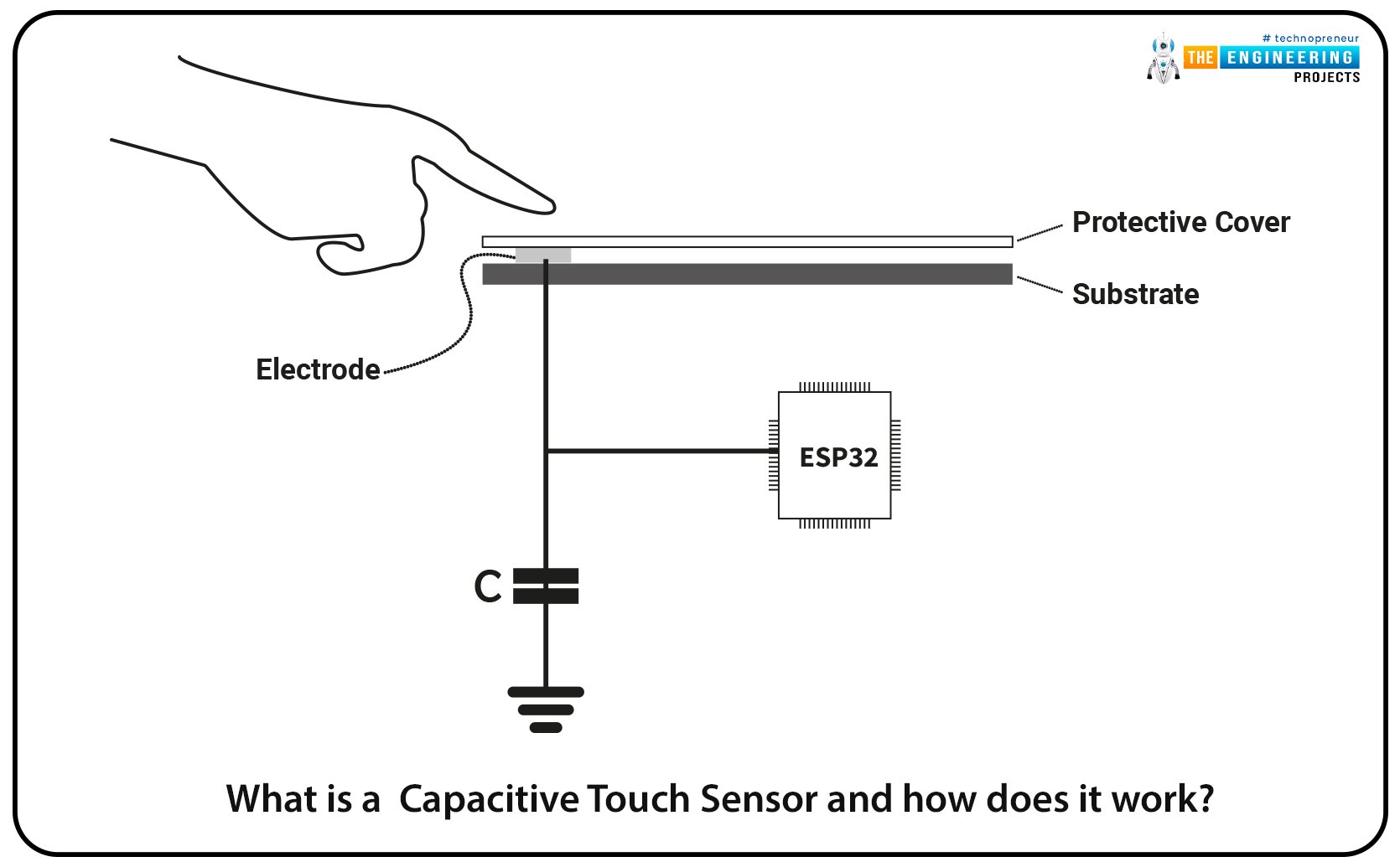
It’s not, we solved this issue before the invention of the computer, just use a capacitive touch sensor, you can literally make any power button completely invisible, this is malicious design.

They did that on the old G4 cube, it illuminated when it was powered on to show where the capacitive power “button” was, but it was basically invisible when the device was powered off.
I’ve seen a decent number of people mention that current placement is too easy to accidentally hit while plugging something in. I’ve also experienced that.
However, if you think Apple is ever going to get over form over function, you’re very mistaken. It’s literally their entire identity.
But why? Same question for the Magic Mouse?
It’s a subtle hint that you don’t have to power off your computer between uses. Most modern computers go into an ultra low power mode when not in use.
or maybe so the mac can be used as a home hub?
Sure. But even without it you don’t need to turn it off
Functionally it’s harder to accidentally press on the bottom.
Although it’s also now harder to intentionally press too. It looks like a finger can fit under there, otherwise you’ll be flipping it over to power on.
apple calls it “feature”
Apple designers: I wAnT tO bE dIfFeReNt
Apple’s new power bottom.
Finally, a power button my stupid cats can’t sit on and turn the computer off with.
Laptop? Oh yeah, they’ll turn that off. Gaming desktop? Yep, but only if it’s annoying for them to have done so. Home server? Yes, but only because they know that’s the most annoying thing to power cycle.
I had a mini sitting there for about a year before someone pointed out it was upside down on my desk. I thought the side that says “Mac mini” was supposed to be facing up? But no, apparently it’s the Apple logo side. With the power button on the model name side, I think that could fuel a nice, juicy OCD argument with my coworker?
I actually kinda like that. The amount of times I’ve accidently shut down my laptop through the dock (very similar shape as the mac mini) just (un)plugging a cable and bumping the power button is ridiculous
I’m gonna guess the hard drive and RAM are still not upgradeable by us?
What do you mean „still“? They moved away from that for years now, they won’t be going back.
The RAM is built into the M4 chip… So unless you are cutting the chip open and doing soldering no
That’s never changing. You can connect a separate storage drive but it’ll be slower than the built in one.
Why would they switch back?
they probably know people don’t actually turns off their devices lol
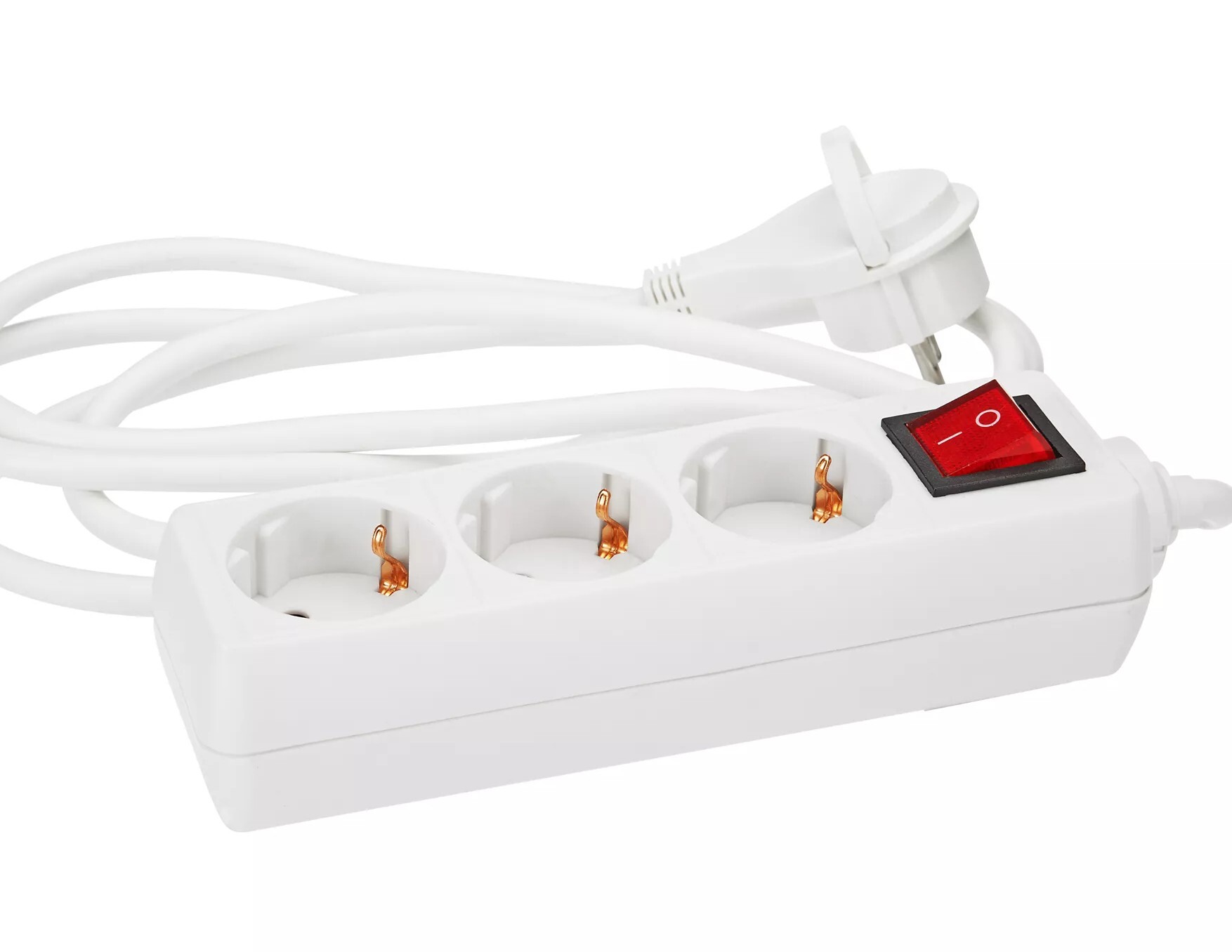
Easy solution:

Sheesh. How often do you need to reach for the power button? It’s got solid state storage. Just flip it on its damn side and stop whinging.
Other people don’t use computers the same way I do, therefore they must be whiny idiots.


