Cisco to Cool Guides@lemmy.caEnglish · 1 year agoUS Majors With The Highest Unemployment/UnderEmployment Ratesimagemessage-square96linkfedilinkarrow-up1371arrow-down123
arrow-up1348arrow-down1imageUS Majors With The Highest Unemployment/UnderEmployment RatesCisco to Cool Guides@lemmy.caEnglish · 1 year agomessage-square96linkfedilink
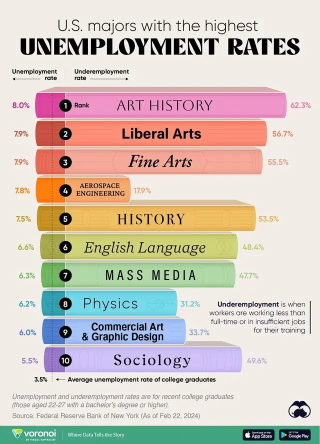
minus-squareFiniteBanjolinkfedilinkEnglisharrow-up2·1 year agoIt sorts by unemployment on the left side of the line, it’s just that the underemployment on the right is a much larger graph.
minus-squarepastermil@sh.itjust.workslinkfedilinkEnglisharrow-up1arrow-down1·1 year agoYeah, well, what I’m trying to say is that the tech majors might have huge underemployment, but don’t make the cut to this chart due to not that many who are completely unemployed.
minus-squareFiniteBanjolinkfedilinkEnglisharrow-up1·1 year agoI just explained to you that the chart is sorted by complete unemployment on the left side.

It sorts by unemployment on the left side of the line, it’s just that the underemployment on the right is a much larger graph.
Yeah, well, what I’m trying to say is that the tech majors might have huge underemployment, but don’t make the cut to this chart due to not that many who are completely unemployed.
I just explained to you that the chart is sorted by complete unemployment on the left side.