
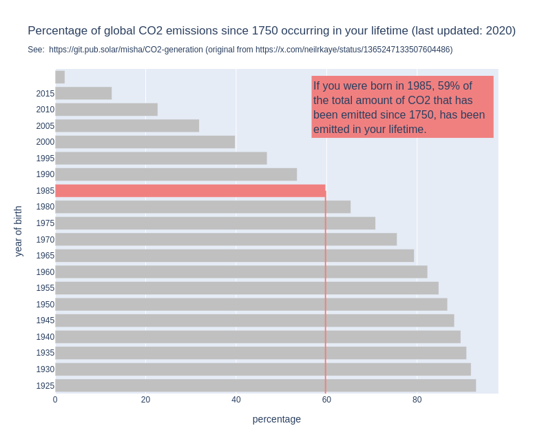
For some years now, I have seen this graph go around on social media. I think it’s a powerful image, because it shows us so clearly that it is happening in our lifetime and under our watch.
But when I use it in my work, I always add the disclaimer the the graph does not show when it was made.
Because that is a problem: the graph might show us that if you are currently 30 years old, 50% of all the CO2 that has been emitted since 1751 has been emitted in your lifetime. But that percentage changes over time.
By now, for people who are currently 30, the percentage will be higher, simply because the annual emissions have gone up since the graph was made.
So I made a new version of the graph, the interactive version of which you can find here: http://mishathings.org:8050/
I wrote a post about this: https://mishathings.org/2024-08-12-how-much-co2-has-been-emitted-in-my-lifetime.html
I would have hoped, with the fact that I’ve been hearing about how dangerous global warming and later climate change is for as long as I can remember, that percentage would have been lower. We really weren’t doing anything to help for the longest time, and now we aren’t doing enough.
Because a lot of people aren’t doing anything to help.